Best Floral Wall Art for Modern Homes in 2026: 15 Nature-Inspired Prints Worth Buying
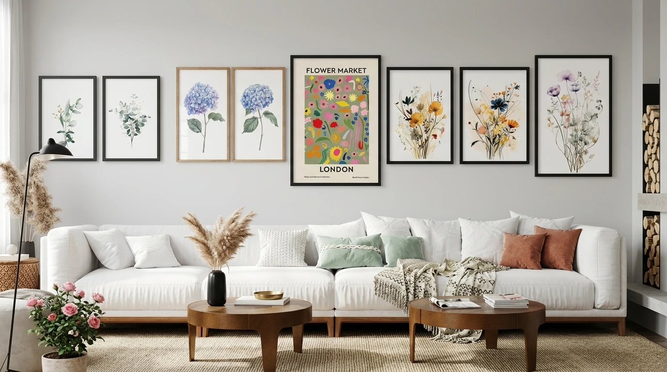
The wrong floral print can make a modern room feel busy or dated the moment you hang it. The right one does the opposite — it softens clean lines, adds warmth to neutral walls, and gives a minimal space a lived-in, personal feel without fighting the rest of your décor.
That’s the real challenge with floral wall art: modern interiors are built around restraint — quiet color palettes, negative space, simple furniture silhouettes — while florals are naturally expressive. The trick is choosing pieces that lean toward line work, muted watercolor, or botanical illustration rather than heavy, saturated bouquets, and sizing them so they read as intentional rather than decorative filler.
Before you scroll through the picks below, here’s the short version:
- Best styles for modern homes: minimalist line art, watercolor botanicals, and neutral vintage-inspired florals read as “modern” far more reliably than bold, photorealistic bouquets.
- Best sizes: a 3-piece set spanning roughly 40–60 inches wide works for most sofas and headboards; a single oversized print works best on a dedicated feature wall.
- Best rooms: living rooms and bedrooms are the easiest wins; bathrooms and entryways work well with smaller, moisture-tolerant framed or canvas pieces.
- What to check before buying: color palette against your existing walls, frame finish, and whether the piece is sized to the furniture beneath it, not just the wall itself.
Quick Picks: Floral Wall Art at a Glance
If you’re short on time, here’s a fast comparison of some of the standout options from this list.
| Best For | Recommended Floral Wall Art | Style | Ideal Room |
|---|---|---|---|
| Neutral modern living rooms | Minimalist Botanical Hydrangea Art Poster Decor | Minimalist botanical | Living room |
| Soft, calming bedrooms | Vintage Neutral Botanical Gallery Wall Print Set | Vintage neutral | Bedroom |
| Blue-and-white color schemes | Set of 3 Blue Watercolor Minimalist Flowers Prints | Modern watercolor | Living room/bedroom |
| Traditional-modern mix | Blue Chinoiserie Watercolor Roses Art Print Set | Chinoiserie botanical | Living room |
| Warm, earthy interiors | Sage Green Modern Wall Art Set of 3 Prints | Modern botanical | Living room/hallway |
| Statement gallery walls | Large William Morris Floral Pattern Art Set Decor | Bold botanical pattern | Living room |
| Subtle greenery lovers | Gold & Green Eucalyptus Wall Art Set of 3 | Botanical/minimal | Bedroom/office |
Each of these is covered in more detail further down, including sizing notes and what kind of interior it suits.
What Makes Floral Wall Art Work in Modern Interiors
Modern design generally favors clean lines, muted palettes, and a sense of visual calm. Florals can feel at odds with that if the artwork is too busy, too saturated, or framed in an ornate style that clashes with simple furniture.
What actually works:
- Reduced color palettes. A print with two or three tones — sage and cream, dusty blue and white — sits much more comfortably in a modern room than a print using six or seven saturated colors.
- Line work and watercolor over hyper-realistic florals. Illustrative or watercolor botanicals read as “art,” while glossy, photo-real bouquets can read as generic décor.
- Consistent framing. Thin wood, matte black, or simple white frames keep multi-piece sets looking cohesive rather than cluttered.
- Deliberate scale. Modern rooms tend to have fewer accessories, so the art needs to be sized correctly to avoid looking like an afterthought — undersized art is one of the most common styling mistakes in otherwise well-designed rooms.
If you’re also considering non-floral options for the same wall, it’s worth comparing styles side by side — our guide to modern abstract wall art covers a similar approach for rooms that want texture and color without literal imagery.
What to Look for When Buying Floral Wall Art
A little planning before you buy saves you from a print that looks great in a product photo but wrong on your actual wall.
Color palette. Match the artwork’s dominant tones to your wall color or your boldest furniture piece — not necessarily both. A blue-and-white print pairs naturally with a neutral wall and a navy or denim sofa; a sage-and-cream piece works well against warm white or greige walls.
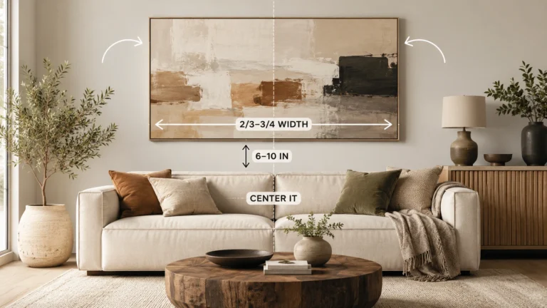
Artwork scale. As a rule of thumb, wall art (or a grouped set) should cover roughly 60–75% of the width of the furniture it hangs above. A 3-piece set above a 78-inch sofa should span somewhere around 48–58 inches total, including the gaps between pieces.
Orientation. Vertical or portrait-oriented florals suit narrow wall spaces and multi-piece sets; horizontal or square pieces suit sideboards, console tables, and single statement placements.
Frame vs. canvas. Framed prints (behind glass) tend to look more polished in living rooms and bedrooms and are easier to keep clean. Canvas wraps have no glass glare, which can be useful in rooms with a lot of natural light, and they give a slightly more casual, gallery-like finish.
Room style. A minimalist Scandinavian room calls for restrained line art or single-tone botanicals. A slightly more traditional-modern living room can carry more detailed watercolor or chinoiserie-style florals without feeling out of place.
Existing furniture. Wood tones matter as much as fabric color. Warm oak furniture pairs naturally with wood-framed florals; black metal or dark furniture pairs better with black-framed or unframed prints.
Wall color. On a stark white wall, warmer or more colorful florals add welcome contrast. On a colored or textured wall, neutral or monochrome botanical prints tend to look cleaner.
Lighting. Rooms with strong natural light can handle framed prints under glass; dimmer rooms or spaces with overhead spotlights may show more glare on glass, so canvas or matte unframed prints can be the better call.
Artwork quality and size options. Check whether a design is offered as a single piece, a matching multi-piece set, and in more than one frame finish — this flexibility makes it far easier to fit an odd-shaped wall.
Placement. Center the artwork’s midpoint at roughly eye level (about 57–60 inches from the floor to the center of the piece), or 6–8 inches above the back of a sofa, headboard, or console if it’s hung above furniture.
If you’d rather not do this math by hand, our Wall Art Size Calculator below can help.
15 Floral Wall Art Picks Worth Buying in 2026
The sets below are all from the same floral and botanical wall art collection, so sizing, framing options, and pricing are consistent across the list — each is offered as a 3-piece set, priced from $34.37 USD (marked down 10% from $38.19 USD at the time of writing), and available in wrapped canvas, wood frame, wood frame with mat, black frame, black frame with mat, white frame, white frame with mat, or unframed print. Availability and pricing can change, so always confirm current details on the product page before buying.
1. Minimalist Botanical Hydrangea Art Poster Decor
- Best for: Neutral, modern living rooms
- Style: Minimalist botanical
- Ideal room: Living room
- Recommended placement: Above a sofa or console table
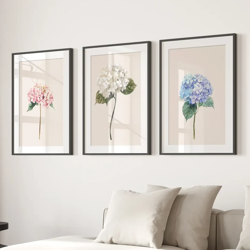
This set leans on soft pink, white, and blue hydrangea illustrations with plenty of white space around each stem, which keeps the overall look restrained rather than floral-heavy. It reads more like line-and-wash botanical art than a traditional flower print.
It suits a modern living room with a neutral sofa and light wood furniture, where you want a hint of color without introducing a full palette. Pair it with a wood-toned or thin black frame to keep the frame from competing with the soft artwork.
Why We Like It: The muted color palette and generous white space make it one of the easiest floral sets to slot into an already-neutral room.
Pros: Soft, adaptable palette; works with several frame finishes; suits small-to-mid-size walls. Cons: The pastel tones may read as too subtle for a bold, high-contrast interior.
2. Vintage Home Decor Botanical Wall Art Set by Sydney Parkinson
- Best for: Bedrooms and reading nooks
- Style: Vintage botanical illustration
- Ideal room: Bedroom
- Recommended placement: Above the bed or a reading chair

Based on historical botanical illustration, this set brings in a more traditional, hand-drawn feel than the purely minimalist options on this list. It suits a modern-vintage or “grandmillennial” bedroom where you want warmth and character rather than stark minimalism.
It pairs well with warm wood headboards, linen bedding, and brass or antique-brass accents.
Why We Like It: It gives a modern bedroom some historical texture without tipping into full cottagecore.
Pros: Distinctive, editorial illustration style; works well as a gallery-style trio.
Cons: Less suited to strictly minimalist or industrial interiors.
3. Set of 3 Blue Watercolor Minimalist Flower Prints
- Best for: Blue-and-white color schemes
- Style: Modern watercolor
- Ideal room: Living room or bedroom
- Recommended placement: Above a sofa or over a bed on a lighter wall
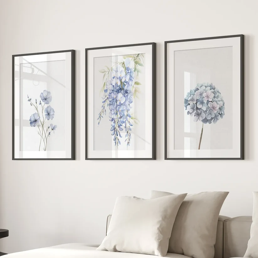
The loose, minimalist watercolor style keeps this set feeling current rather than country-cottage, while the blue palette makes it a strong match for coastal-modern or blue-and-white interiors.
It works particularly well against a white or pale gray wall, paired with navy or denim textiles elsewhere in the room.
Why We Like It: Blue florals are one of the easiest colorways to build a whole room’s palette around.
Pros: Strong color-matching potential; minimalist enough for modern rooms.
Cons: Needs a fairly neutral wall to stand out — busy or dark walls will mute the effect.
4. Blue Chinoiserie Watercolor Roses Art Print Set
- Best for: Traditional-modern (“transitional”) living rooms
- Style: Chinoiserie botanical
- Ideal room: Living room or dining room
- Recommended placement: Above a console or sideboard
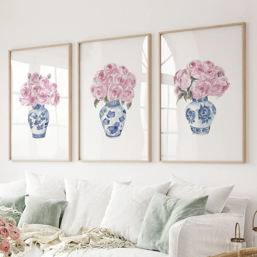
This set features roses illustrated in ginger-jar and porcelain-inspired blue-and-white tones — more detailed than the purely minimalist picks here, but still cohesive enough for a modern room that isn’t strictly minimalist.
It suits a transitional living or dining room with some traditional furniture pieces mixed into an otherwise contemporary layout.
Why We Like It: It bridges classic chinoiserie motifs with a clean, modern presentation, which is a good fit for rooms that mix eras.
Pros: More detail and visual interest than minimalist sets; strong blue-and-white cohesion.
Cons: Less suited to strictly minimalist or Scandinavian interiors.
5. Vintage Neutral Botanical Gallery Wall Print Set
- Best for: Calm, neutral bedrooms
- Style: Vintage neutral botanical
- Ideal room: Bedroom
- Recommended placement: Above the bed
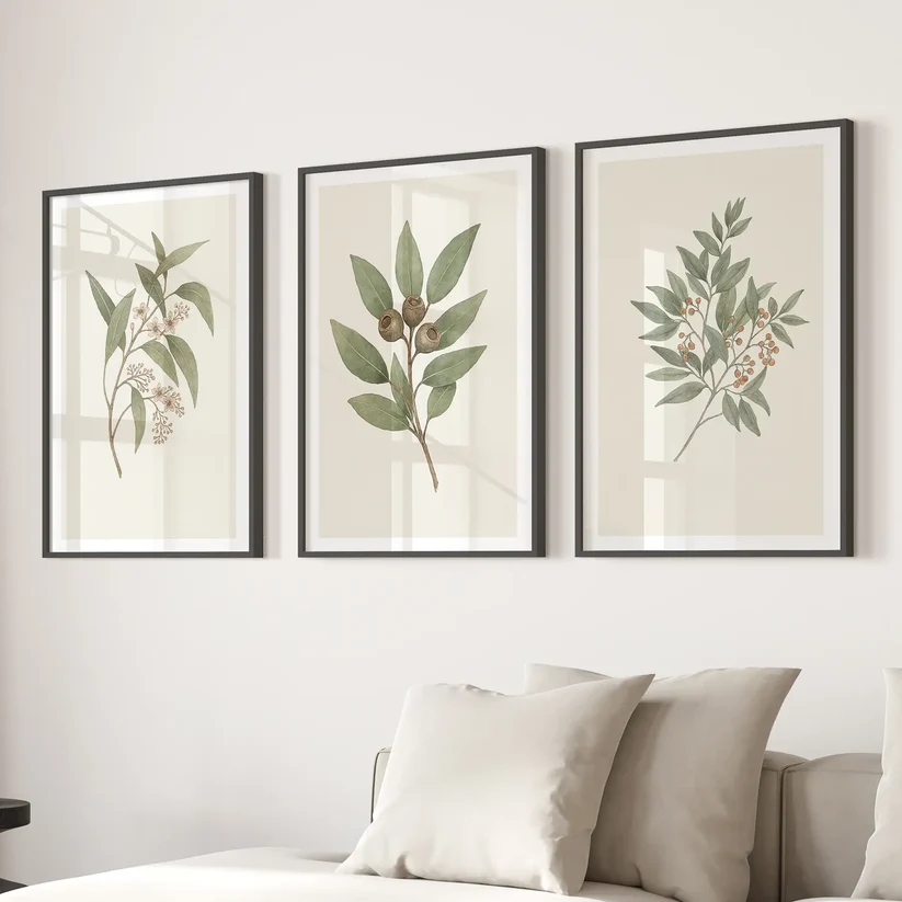
Using a muted, earthy palette, this set is designed to sit quietly on the wall rather than draw immediate attention — ideal for a bedroom meant to feel calm.
It pairs naturally with linen bedding, rattan or wood furniture, and warm white walls.
Why We Like It: The neutral, low-contrast palette makes it one of the safest choices if you’re unsure about committing to color.
Pros: Extremely versatile with neutral décor; low risk of clashing with existing furniture.
Cons: May feel too muted for a room that already leans neutral throughout.
6. Meadow Flower Watercolor Wall Art Poster Set
- Best for: Kitchens, breakfast nooks, and casual living spaces
- Style: Soft watercolor botanical
- Ideal room: Kitchen or living room
- Recommended placement: Above a bench, breakfast nook, or accent wall
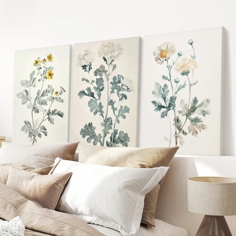
This set uses soft, neutral-toned watercolor florals that work well in more lived-in, casual spaces without looking overly rustic.
It suits kitchens with wood cabinetry or living rooms with a more relaxed, layered styling approach.
Why We Like It: It’s one of the more adaptable options if you want florals outside the usual bedroom-or-living-room placement.
Pros: Works in less typical rooms like kitchens; soft, unobtrusive palette.
Cons: The soft tones can get lost against busy backsplash tile or patterned walls.
7. Floral Watercolor Wall Decor: Elegant Garden Set of 3 Prints
- Best for: Bright, sunlit bedrooms
- Style: Watercolor botanical
- Ideal room: Bedroom
- Recommended placement: Above the headboard
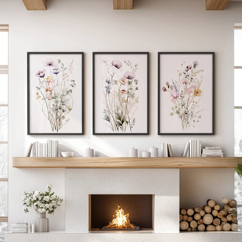
Featuring soft spring-toned florals, this set is designed to bring warmth and light into a bedroom, particularly one that gets good natural light.
It complements light wood headboards and pale, sunlit color schemes.
Why We Like It: The warmer, sunlit palette makes it a good option for bedrooms that otherwise feel a little flat or cool in tone.
Pros: Warm, inviting color palette; good scale for headboard placement.
Cons: Less suited to cooler, blue-toned bedroom palettes.
8. Neutral Watercolor Wildflower Art Prints Set
- Best for: Understated, textural interiors
- Style: Minimalist watercolor
- Ideal room: Living room or bedroom
- Recommended placement: Above a sofa or accent chair
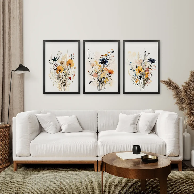
This set combines loose wildflower illustrations with a restrained, neutral palette, giving it a slightly more organic, less “arranged” feel than the more formal botanical sets on this list.
It works well in interiors that lean into natural materials — linen, boucle, unfinished wood — rather than sleek, glossy surfaces.
Why We Like It: It reads as art rather than décor, which suits rooms designed around texture instead of color.
Pros: Organic, less formal look; pairs well with natural materials.
Cons: The loose style may feel too casual for a very formal, symmetrical room.
9. Pastel Botanical Wall Art Set of 3 Pieces (Gray and Beige)
- Best for: Minimalist, tonal interiors
- Style: Minimalist botanical
- Ideal room: Bedroom
- Recommended placement: Above a bed or dresser
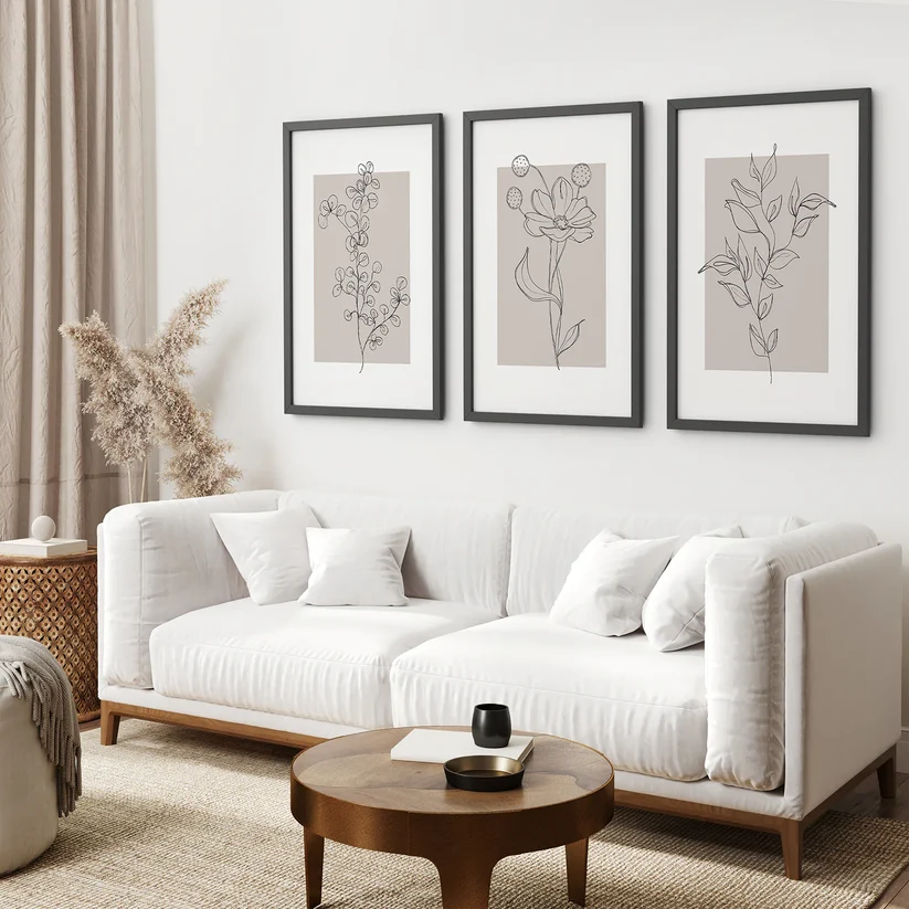
Kept almost entirely to gray and beige tones, this set is one of the most restrained options here — closer to tonal wall art than a typical floral print.
It suits a minimalist bedroom built around a monochrome or tonal color scheme, where even a subtle floral motif needs to stay within the existing palette.
Why We Like It: For anyone nervous about introducing florals into a strictly neutral scheme, this is about as low-risk as it gets.
Pros: Extremely easy to match to existing neutral décor; subtle enough for minimalist purists. Cons: Some buyers may find it too muted to register as “floral” at a glance.
10. Boho Flower Market Set of 3 Posters (New York, London, Rome)
- Best for: Eclectic, well-traveled interiors
- Style: Boho flower-market illustration
- Ideal room: Living room or entryway
- Recommended placement: Above a console table or in a gallery wall grouping
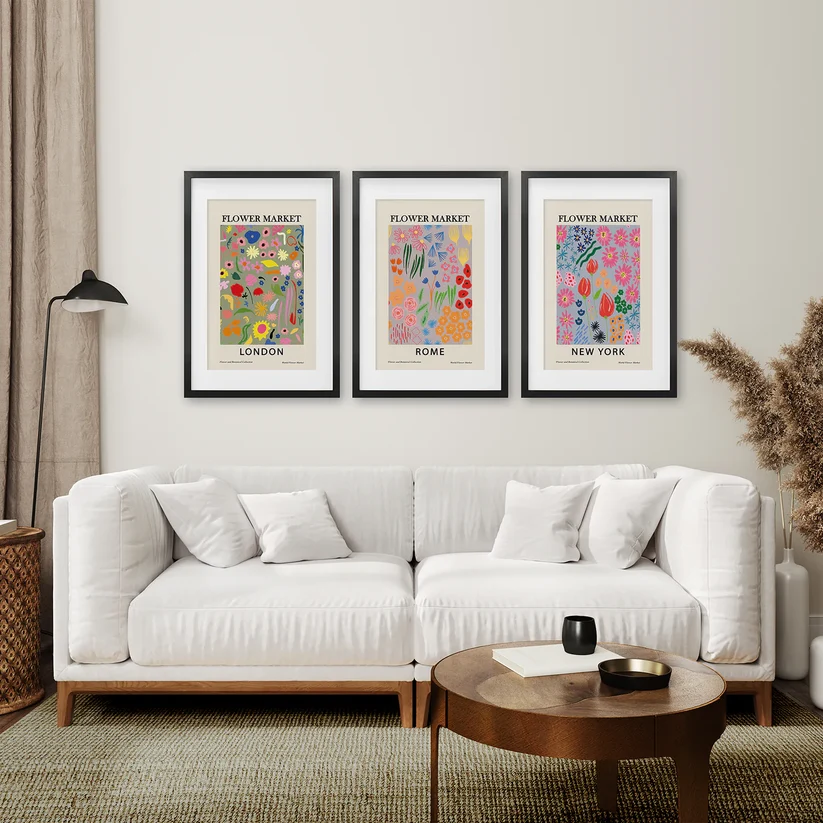
This set reimagines the flower-market poster trend with a city-specific twist, giving it a slightly more personal, curated feel than a generic botanical print.
It suits an eclectic or boho-modern living room, especially one already featuring travel-inspired décor.
Why We Like It: The city references give it a story, which makes it a strong conversation-starter piece rather than pure background décor.
Pros: Distinctive concept; works well mixed into a gallery wall.
Cons: The typographic, poster-style format is a bit more casual than the watercolor or line-art pieces on this list.
11. 3 Piece Contemporary Art Set of Posters: One Line Drawing
- Best for: Strictly minimalist or Scandinavian interiors
- Style: Minimalist line art
- Ideal room: Living room, bedroom, or home office
- Recommended placement: Above a desk, sofa, or bed
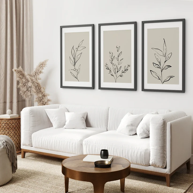
Using single-line botanical illustrations on plain backgrounds, this is the most pared-back option on the list and the closest to true minimalist wall art.
It’s a strong fit for Scandinavian, Japandi, or otherwise very minimal interiors where even watercolor florals might feel like too much.
Why We Like It: It gives you the botanical motif without any color commitment at all — useful if you’re not ready to introduce florals as a color statement.
Pros: Extremely versatile; suits almost any wall color; works in unconventional rooms like offices. Cons: Less impact as a single statement piece — best used as a set or paired with other minimal art.
12. Large William Morris Floral Pattern Art Set Decor
- Best for: Statement gallery walls
- Style: Bold botanical pattern
- Ideal room: Living room
- Recommended placement: Feature wall or large gallery-style grouping
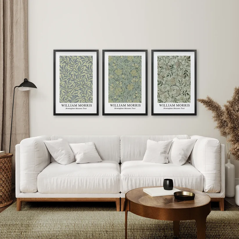
Drawing on William Morris–style repeating floral patterns, this is the boldest and most pattern-heavy option on the list, offered in a larger scale than several of the other sets.
It works best on a dedicated feature wall or as the anchor piece of a larger gallery wall, ideally in a room with fairly neutral furniture so the pattern can carry the visual interest.
Why We Like It: If everything else on this list feels too quiet for your space, this is the pick that makes an actual statement.
Pros: Strong visual impact; good option for a larger or more dominant wall.
Cons: Needs a fairly restrained room around it — busy furniture or patterned textiles will compete with it.
13. Light Blue Hydrangea Flower Wall Art Poster Set
- Best for: Coastal-modern or Hamptons-style interiors
- Style: Modern botanical
- Ideal room: Living room or bedroom
- Recommended placement: Above a sofa or bed
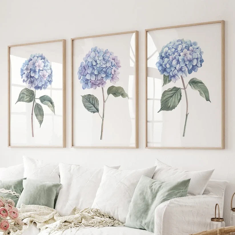
This set uses a soft, Hamptons-inspired blue palette with hydrangea motifs, striking a middle ground between the fully minimalist sets and the more decorative chinoiserie option above.
It suits a coastal-modern living room or bedroom with white or pale-toned furniture and natural textures like linen or rattan.
Why We Like It: It’s a reliable middle-ground pick if you want color and a recognizable floral motif without going fully traditional.
Pros: Balanced level of detail; works in both living rooms and bedrooms.
Cons: Blue-toned pieces need a genuinely neutral wall to avoid looking muddy.
14. Sage Green Modern Wall Art Set of 3 Prints
- Best for: Warm, earthy modern interiors
- Style: Modern botanical
- Ideal room: Living room or hallway
- Recommended placement: Above a console, sofa, or in a hallway gallery
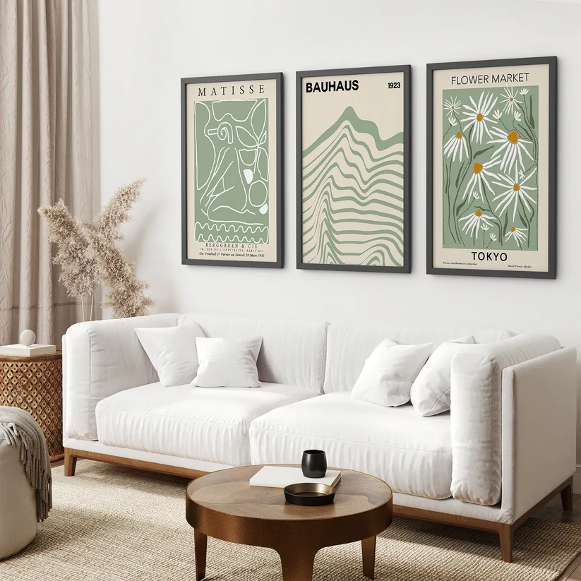
Sage green has become one of the defining neutrals of modern interior design, and this set leans into that with softly illustrated botanical motifs in sage and cream tones.
It’s an easy match for warm white or greige walls, natural wood furniture, and boucle or linen upholstery — the current default look for a lot of modern living rooms.
Why We Like It: Sage green florals are about as close to a “safe bet” as this category gets right now, without feeling generic.
Pros: On-trend, versatile color; pairs with most current modern color schemes.
Cons: If your room already has a lot of green in it, this may be one green too many.
15. Gold & Green Eucalyptus Wall Art Set of 3
- Best for: Subtle greenery without a full floral motif
- Style: Botanical / minimal
- Ideal room: Bedroom or home office
- Recommended placement: Above a desk, dresser, or accent chair
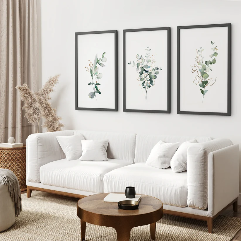
For anyone who wants the botanical category without committing to actual flowers, this eucalyptus-focused set offers greenery with small gold accents, giving it a bit more warmth than a plain green-and-white print.
It works well in a bedroom or office that wants a natural, calming element without introducing a strong color statement.
Why We Like It: It’s the pick for buyers who like the idea of botanical wall art but find florals themselves a bit too decorative for their space.
Pros: Subtle, calming palette; suits both bedrooms and workspaces.
Cons: Less of a true “floral” piece if you specifically want flowers rather than foliage.
Which Floral Wall Art Style Is Right for You?
| Style | Visual Effect | Ideal Room | Ideal Interior Style |
|---|---|---|---|
| Minimalist floral | Calm, quiet, understated | Bedroom, office | Scandinavian, Japandi |
| Botanical (line art/illustration) | Clean, graphic, structured | Living room, hallway | Modern, minimalist |
| Abstract floral | Loose, artistic, expressive | Living room | Contemporary, eclectic |
| Vintage floral | Warm, nostalgic, layered | Bedroom, dining room | Transitional, grandmillennial |
| Bold colorful floral | Energetic, statement-making | Living room, entryway | Maximalist, eclectic |
| Neutral floral | Versatile, low-risk, blends in | Any room | Nearly any modern style |
If you’re not sure which category fits your space, our Wall Art Finder can help narrow it down based on your room and existing color palette — more on that below.
How to Choose Floral Wall Art for a Modern Home
Start with your wall’s existing color and your largest furniture piece, not the artwork itself. Pick a print whose dominant color either matches your wall (for a subtle look) or contrasts gently with it (for a focal point), and check that the color temperature — warm or cool — matches your existing wood tones and metals.
Then narrow by style: line art and minimal watercolor for strictly modern or Scandinavian rooms; vintage or chinoiserie-style botanicals for transitional spaces that mix old and new; bold pattern pieces only for rooms with enough negative space to support them.
What Size Floral Wall Art Should You Buy?
For a single print above a sofa or bed, aim for roughly two-thirds the width of the furniture. For a 3-piece set, add up the total width of all three prints plus the gaps between them, and use that combined figure — not the width of a single print — when comparing it to your furniture.
As a general guide:
- Above a 60-inch loveseat: a set totaling around 36–44 inches wide
- Above a 78–84-inch standard sofa: a set totaling around 48–58 inches wide
- Above a queen or king headboard: a set totaling around 50–65 inches wide
If you’re working with an unusual wall shape, a narrow hallway, or a sofa on the smaller or larger end, our Wall Art Size Calculator can work out a size range for your specific furniture dimensions rather than relying on rough averages.
Use the Wall Art Size Calculator →
Should You Choose Canvas or Framed Floral Prints?
Framed prints (with or without a mat) tend to look more finished in living rooms and bedrooms, and they’re easy to keep clean since the glass wipes down in seconds. They can pick up glare in very bright or spotlit rooms, though, so angle or placement matters.
Canvas wraps skip the glass entirely, which avoids glare altogether and gives artwork a slightly more relaxed, gallery-style presence. They’re a solid choice for sunrooms, breakfast nooks, or any wall that gets direct light for part of the day.
For a deeper comparison across canvas, framed, and acrylic options generally, see our guide on canvas vs. framed prints vs. acrylic wall art.
What Floral Wall Art Works Best in a Living Room?
Living rooms usually benefit from florals with a bit more visual weight — a 3-piece set or one larger statement print — since the wall above a sofa is typically the largest, most visible wall in the home. Sage green, neutral watercolor, and line-art botanicals tend to work across the widest range of living room styles.
If you’re planning the whole wall rather than just the artwork, our guides on modern living room wall art ideas and wall art colors for a living room go into more detail on building the full look, and how high to hang wall art above a sofa covers placement specifics.
What Floral Wall Art Works Best in a Bedroom?
Bedrooms tend to favor softer, more calming florals — muted watercolor, vintage botanical, or pastel-toned sets — placed above the headboard or on the wall directly opposite the bed. Because bedrooms are typically viewed at a resting distance rather than in passing, slightly more detailed or intricate prints work better here than they would in a busier living room.
For more bedroom-specific direction, our guide to the best canvas prints for bedrooms covers additional non-floral options if you want to compare styles.
Floral Wall Art for Bathrooms: What to Know
Bathrooms can absolutely work for floral prints, but material matters more here than anywhere else in the home. Framed prints under glass or sealed canvas hold up better against humidity than unframed paper prints, and a smaller scale — one piece rather than a large set — usually suits the more limited wall space in most bathrooms.
How to Match Floral Wall Art With Your Existing Decor
Rather than trying to match every color in the room, pick one anchor: either your wall color or your largest upholstered piece. Choose artwork that shares at least one dominant tone with that anchor, and let everything else in the room stay in its existing neutral or accent palette. This keeps the room from feeling like it’s built entirely around the art.
Frame finish should follow your existing metal and wood tones — black frames with black or brass hardware, wood frames with wood furniture, white frames in bright, high-contrast rooms.
Can’t Decide Which Floral Style Fits Your Space?
If you’ve read through all fifteen picks above and you’re still not sure whether minimalist, vintage, or bold botanical is the right direction for your room, that’s a fairly common sticking point — style preference and room compatibility aren’t always the same thing.
Our Wall Art Finder walks through a short set of questions about your room, wall color, and existing furniture, and points you toward the style category most likely to work.
Botanical vs. Floral Wall Art: What’s the Difference?
The terms are often used interchangeably, but there’s a useful distinction. Floral art typically depicts flowers themselves — blooms, petals, bouquets. Botanical art more often refers to plant illustration broadly, including leaves, stems, and greenery, frequently in a more scientific or illustrative style (think vintage botanical textbook plates). Many of the sets in this list, like the eucalyptus and sage green options, sit closer to “botanical,” while the hydrangea and rose-focused sets are more purely “floral.” In practice, both categories overlap heavily and can be mixed on the same wall without looking mismatched.
Frequently Asked Questions
Is floral wall art still in style in 2026?
Yes — though the styling has shifted. Bold, saturated floral prints have given way to minimalist line art, muted watercolor, and neutral botanical illustration, which fit more easily into modern interiors than the maximalist floral trends of a few years ago.
Is floral wall art suitable for modern homes?
It is, as long as the palette and framing are kept simple. Minimalist or neutral-toned floral pieces in thin wood, black, or white frames work well in modern spaces; heavily detailed, brightly colored florals are harder to place in a strictly modern room.
What color floral wall art works best in a neutral room?
Sage green, dusty blue, blush pink, and gray-beige tones all pair naturally with neutral walls and furniture, since they read as an extension of the existing palette rather than a bold departure from it.
What size floral wall art should I buy?
As a general rule, aim for artwork (or a full set including gaps) that spans roughly 60–75% of the width of the furniture beneath it. Use a size calculator if you want a more precise range for your specific space.
Is botanical wall art the same as floral wall art?
Not exactly. Floral art focuses on flowers specifically, while botanical art can include leaves, stems, and greenery more broadly. The two categories often overlap and mix well together.
Is botanical wall art the same as floral wall art?
Not exactly. Floral art focuses on flowers specifically, while botanical art can include leaves, stems, and greenery more broadly. The two categories often overlap and mix well together.
Should floral wall art match my furniture?
It should coordinate rather than match exactly. Pick artwork that shares one dominant color or tone with your wall or your largest furniture piece, and let the rest of the room stay neutral.
Is canvas or framed floral wall art better?
Neither is universally better — framed prints look more polished and are easy to clean, while canvas avoids glass glare and suits sunlit rooms. The right choice depends on your room’s lighting and how formal you want the piece to look.
Where should floral wall art be placed?
Center the artwork at roughly eye level, or about 6–8 inches above the back of a sofa, headboard, or console if it’s hung above furniture.
Final Thoughts: Choosing the Right Floral Wall Art
For most modern homes, the safest starting point is a neutral or muted-color set — sage green, soft blue, or gray-and-beige — in a simple wood or black frame, sized to roughly two-thirds the width of the furniture beneath it. From there, layer in more pattern or color only if your room has enough visual breathing room to support it.
Living rooms tend to suit slightly bolder or larger sets, bedrooms suit softer and more detailed pieces, and bathrooms call for smaller, moisture-tolerant framed or canvas prints. If you’re still weighing options, run your measurements through the Wall Art Size Calculator or let the Wall Art Finder narrow down a style, then take a closer look at whichever picks from this list match your room best.
This article contains affiliate links. If you buy through one, we may earn a small commission at no extra cost to you.