
13 Best Modern Abstract Wall Art Pieces for Every Room in 2026
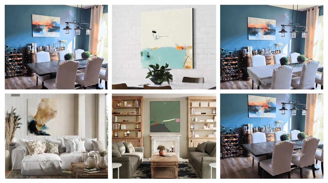
Let’s be honest: buying modern abstract wall art sounds easy until you actually have to choose one.
You see dozens of beautiful designs online, and suddenly you’re wondering whether that blue piece will work with your beige sofa, whether the artwork is big enough for the wall, or whether a bold painting will make the room look too busy.
That’s exactly why I put this guide together.
Instead of throwing a random list of pretty artwork at you, I’ve gone through these 13 modern abstract wall art pieces and grouped them by their overall look, color, and the kind of room they can work in.
Some are quiet and minimal. Some are colorful and impossible to ignore. A few are more dramatic, while others have that relaxed coastal feel.
So, whether you’re decorating a living room, bedroom, home office, dining area, gaming room, bathroom, kitchen, or have one empty wall that needs some personality, there should be something here worth considering.
One quick pricing note: The artwork featured here starts at around $165 for the entry-level configuration shown at the time of writing. Choosing a larger size or a different finish can increase the price, so check the product page for the current price before buying.
Why Modern Abstract Wall Art Works in (Almost) Any Room
Abstract art solves a problem that literal art (landscapes, portraits, florals) doesn’t: it doesn’t compete with anything else in the room. A photograph of a mountain has to “match” your decor’s mood. A geometric or color-field abstract piece adds color, shape, and scale — which means it tends to work whether your room is minimalist, maximalist, warm, or cool. That flexibility is a big part of why modern abstract wall art has stayed one of the most consistently popular wall art categories rather than a passing trend — it adapts to the room instead of dictating it.
All 13 Pieces at a Glance
| Artwork | Overall Style | Where I’d Use It | Best For |
|---|---|---|---|
| Geo Formation | Geometric / Organic | Living room | Warm, earthy interiors |
| Cellist | Geometric | Bedroom / Office | Subtle geometric style |
| Unwavering Willpower | Minimalist | Bedroom / Hallway | Neutral rooms |
| Fusion | Contemporary / Minimalist | Dining room | Understated interiors |
| Macroscopic | Textured / Organic | Living room | A strong anchor piece |
| Pinnacle | Textured / Coastal | Living room / Bedroom | Earthy color palettes |
| Yellow Graffiti | Bold / Maximalist | Office / Game room | High-energy spaces |
| Tai Chi | Bold / Contemporary | Living room / Office | Statement walls |
| The Wave | Coastal / Atmospheric | Bedroom / Living room | Calm interiors |
| Sunny Weather in Kenting | Coastal / Contemporary | Kitchen / Casual spaces | Relaxed rooms |
| Abstract Harmony | Surreal | Entryway / Living room | Conversation starters |
| Until I Find You | Dramatic / Surreal | Dining room / Living room | Moody interiors |
| Infinity III | Color-block / Contemporary | Living room / Office | Modern open spaces |
Geometric Abstract
Sharp lines, defined shapes, structured compositions. Best for spaces that want energy without chaos.
1. Geo Formation — My Pick for Warm, Earthy Rooms
Starting price: around $165
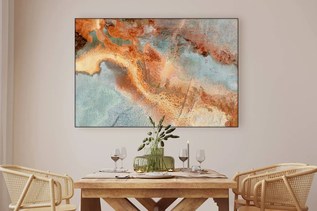
If your home has warm wood, beige furniture, cream walls, or little touches of rust and green, Geo Formation is one of the first pieces I’d look at.
The artwork combines geometric shapes with earthy copper, rust, turquoise, and related tones. It feels organized without being overly rigid.
That’s what I like about it.
Some geometric artwork can feel cold and overly precise. Geo Formation has enough variation in its shapes and colors to keep it feeling warmer and more approachable.
Why it stands out
It’s the kind of artwork that can bring several colors together without forcing you to completely redecorate the room around it.
Pros
- Warm color palette
- Modern but not overly cold
- Works nicely with wood furniture
- Can act as a focal point
Something to keep in mind
Several colors are competing for attention, so I’d avoid putting it in a room that’s already packed with patterned rugs, cushions, curtains, and other colorful artwork.
I’d choose it for:
A living room or dining room with beige, cream, brown, rust, teal, or natural wood tones.
What Buyers Say



2. Cellist — For a Quieter Geometric Look
Starting price: around $165
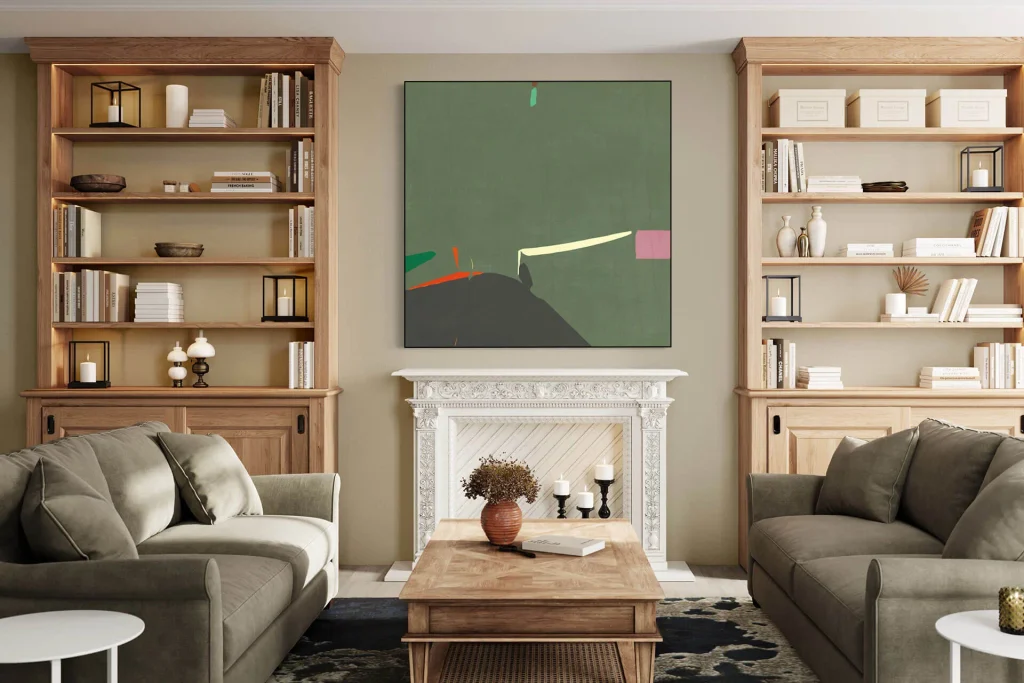
If you like geometric artwork but don’t want something that’s screaming for attention from across the room, Cellist is worth a look.
The darker green, black, red, and teal elements give the piece some character, while the overall composition remains relatively controlled.
Why it stands out
It has personality, but it doesn’t necessarily need to become the entire room’s personality.
That’s useful for bedrooms and home offices where you may want something interesting on the wall without creating too much visual noise.
Pros
- Structured design
- Darker, sophisticated palette
- Works well with neutral furniture
- Good option for offices and bedrooms
Something to keep in mind
Because of the darker elements, I’d be a little more careful with it in a very small or poorly lit room.
I’d choose it for:
A bedroom, study, reading area, or home office with green, charcoal, black, wood, or neutral tones.
What Buyers Say

Minimalist & Neutral Abstract
Muted palettes, negative space, restraint. Best for spaces that already have visual interest elsewhere and don’t need the art to compete.
3. Unwavering Willpower — If You Like Minimalist Art
Starting price: around $165
Not everyone wants bright colors on their walls.
Sometimes you just want something that makes the room feel finished without taking over.
That’s where Unwavering Willpower makes sense.
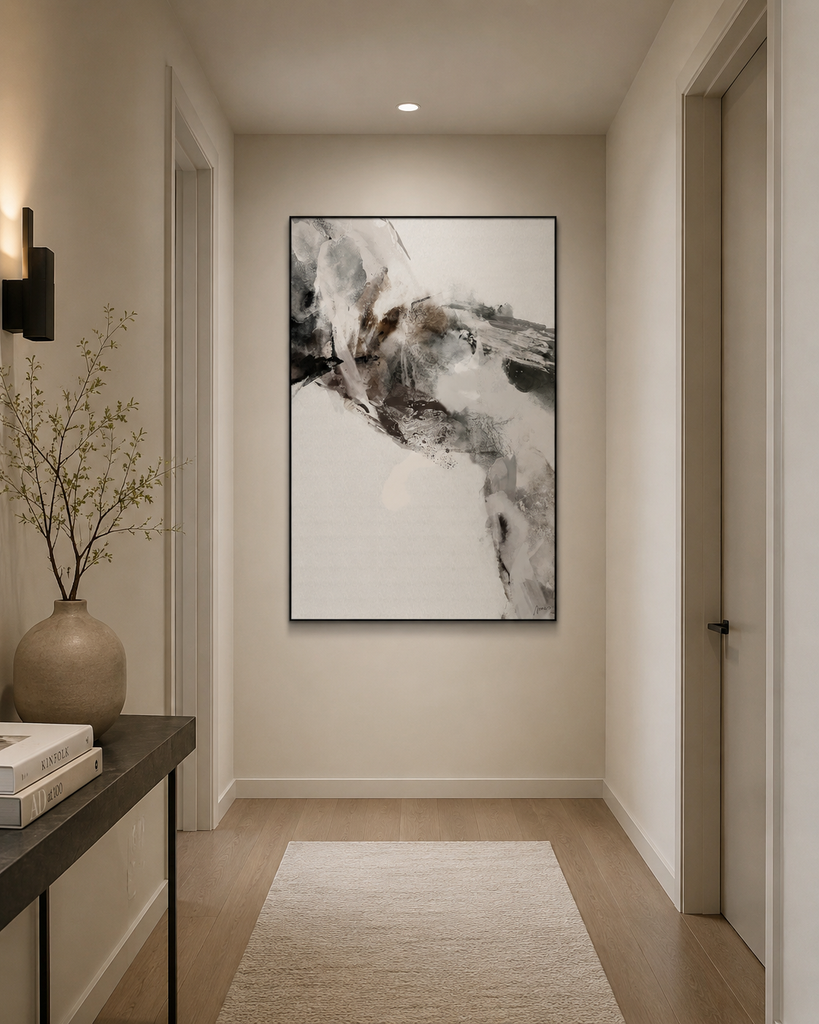
The artwork uses mostly misty white and charcoal tones, with a composition that has a mountain-through-the-fog kind of feeling.
Why I like this one
It’s easy to imagine in a bedroom, hallway, or minimalist living room because it doesn’t introduce a huge new color palette.
If your furniture is already doing most of the talking, this type of artwork can quietly pull everything together.
Pros
- Very easy color palette to work with
- Calm appearance
- Fits minimalist interiors
- Doesn’t compete heavily with furniture
Something to keep in mind
If your entire room is already white, gray, and extremely neutral, you may actually get more impact from one of the colorful pieces in this collection.
I’d choose it for:
A minimalist bedroom, hallway, apartment, or neutral living room.
What Buyers Say


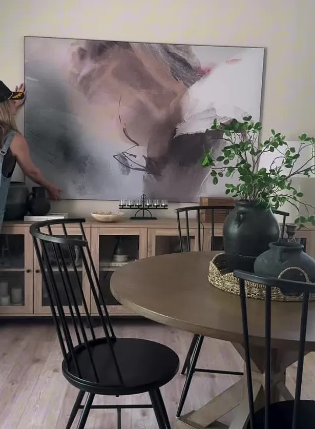
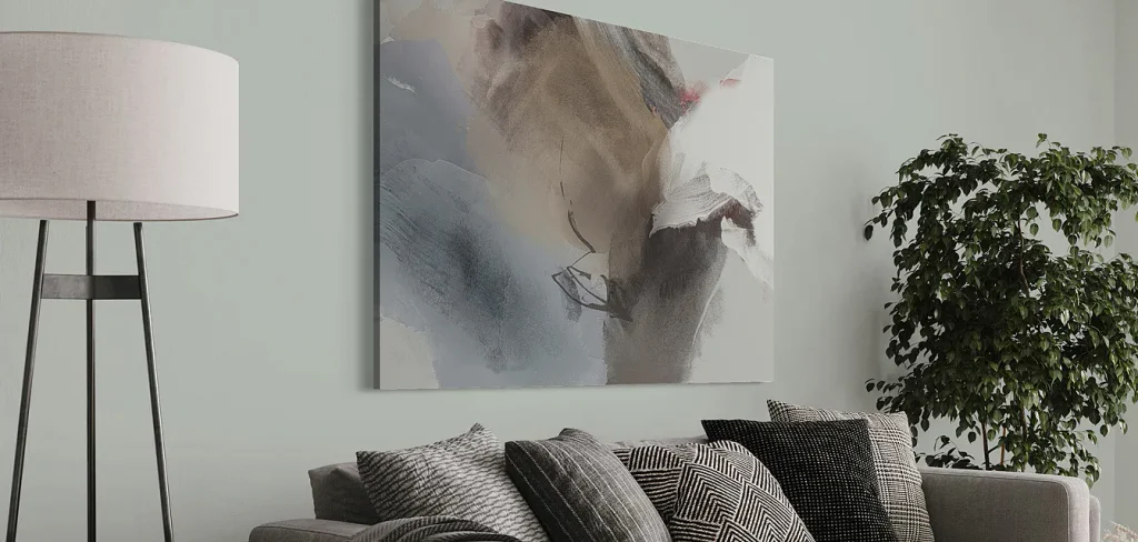
4. Fusion — Simple at First, More Interesting Up Close
Starting price: around $165
Fusion is one of those pieces that doesn’t immediately shout for attention.
It uses slate gray, charcoal, and warm sepia tones, with sweeping lines that give the artwork a sense of movement.
That’s what makes it interesting.
It’s restrained, but it isn’t boring.
Why it works
If you find traditional minimalist art a little too plain, but colorful abstract art feels like too much, Fusion sits somewhere in between.
Pros
- Neutral colors
- Interesting movement
- Easy to pair with modern furniture
- Works nicely in dining areas
Something to keep in mind
Don’t choose this one if your main goal is a bright statement wall.
It’s much more about subtle movement and texture.
I’d choose it for:
A dining room, kitchen, living room, or office with cream, beige, gray, black, or natural wood.
What Buyers Say


Textured & Organic Abstract
Layered, tactile, more “painted” than “designed.” Best for spaces that want depth up close, not just color from across the room.
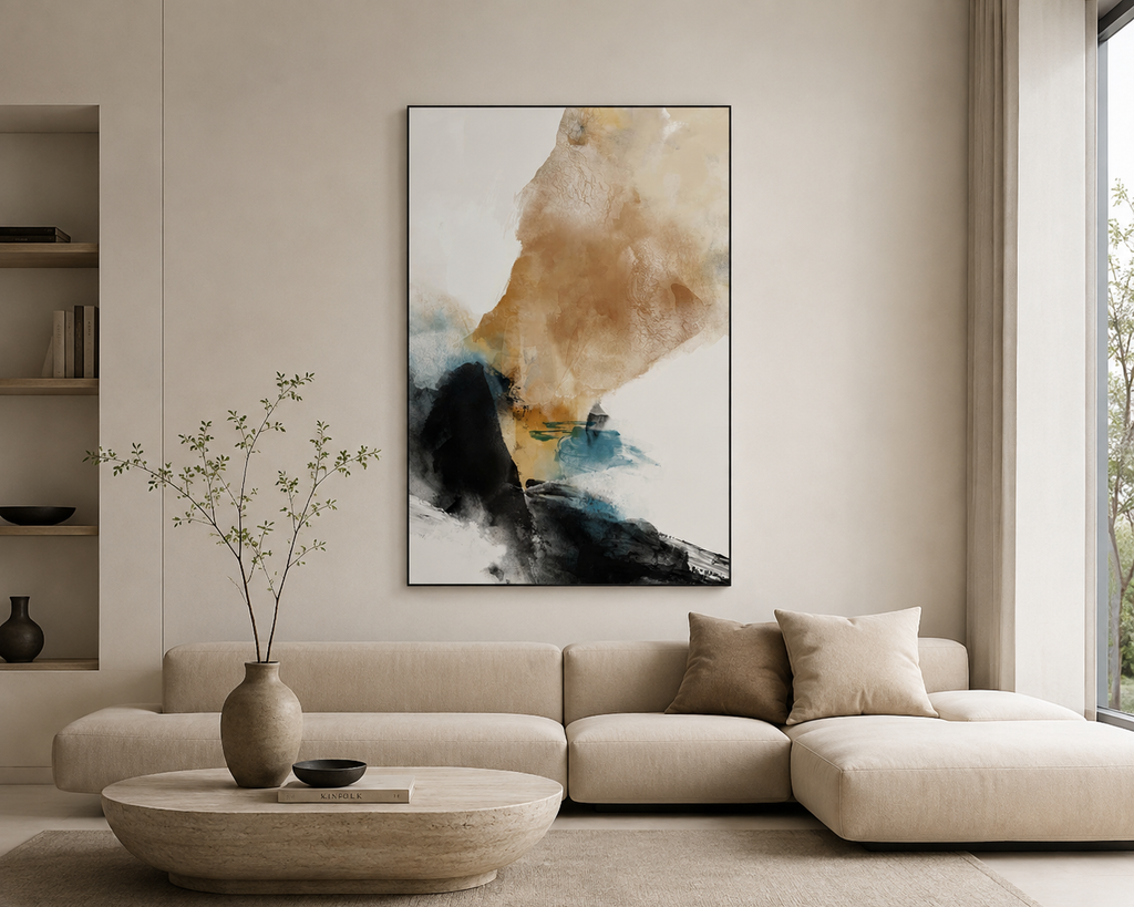
5. Macroscopic — The One I’d Pick for Texture and Depth
Starting price: around $165
Macroscopic is much busier than the minimalist options above, but that’s not necessarily a bad thing.
The artwork brings together sepia, ochre, white, dark ink-like tones, and touches of blue.
A lot is happening inside the composition.
Why it works
If you’ve got a fairly simple room and one large wall that feels empty, this kind of artwork can give the room a focal point without requiring you to add a bunch of smaller decorations.
I’d especially consider it for a minimalist living room where the furniture is fairly simple.
Pros
- Lots of visual depth
- Earthy overall feeling
- Strong focal-point potential
- Works with neutral furniture
Something to keep in mind
This is not the piece I’d choose if your room already has a lot of patterns and decorative objects.
It needs some breathing room.
I’d choose it for:
A living room with white, cream, beige, walnut, charcoal, or muted blue.
What Buyers Say



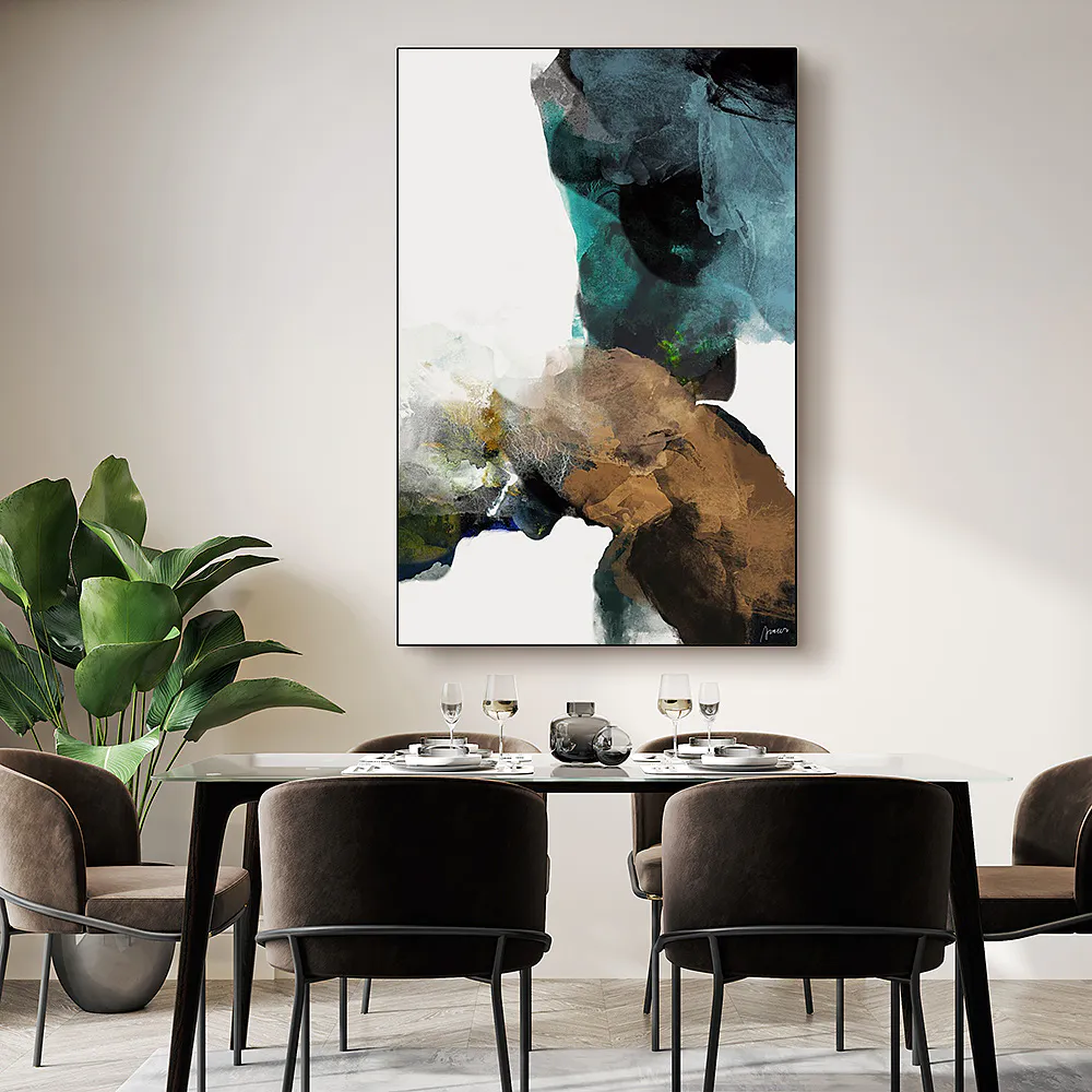
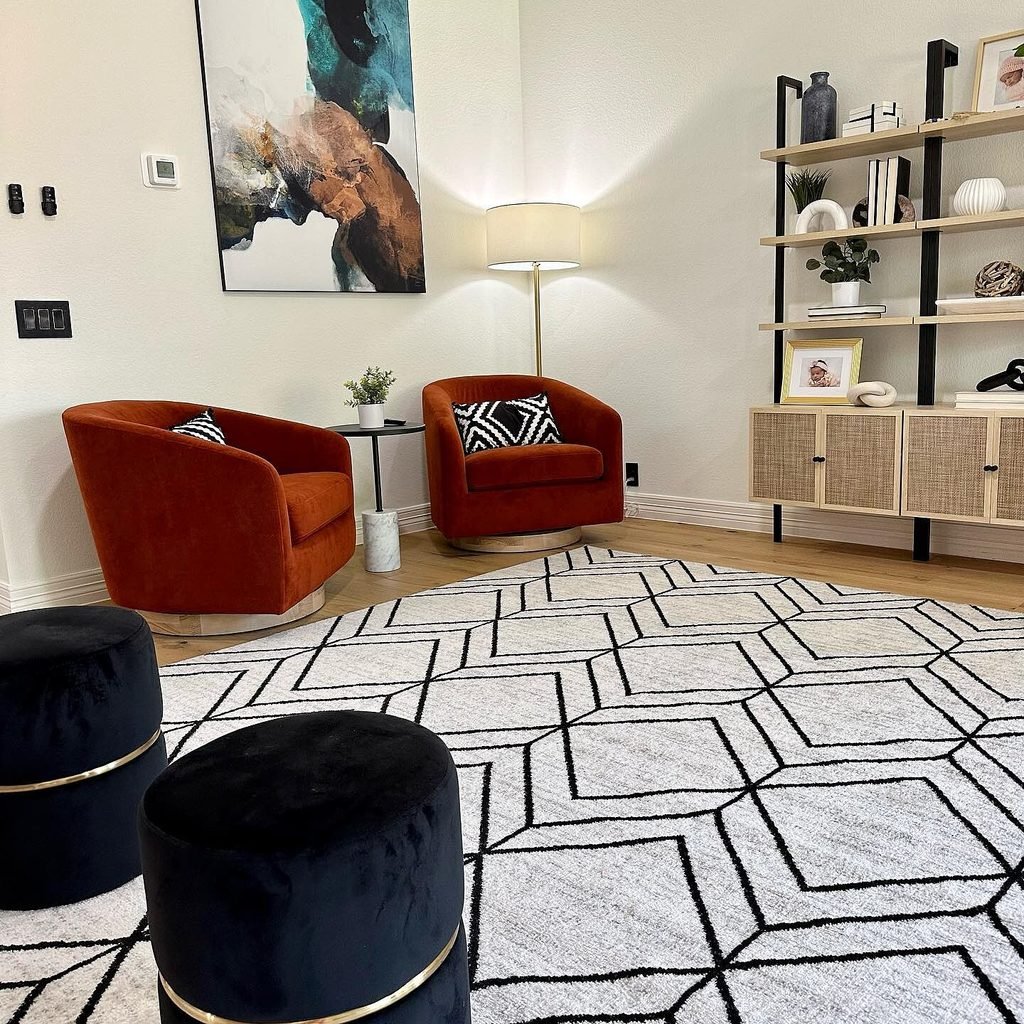
6. Pinnacle — A Good Middle Ground Between Earthy and Coastal
Starting price: around $165
Pinnacle is interesting because it doesn’t feel like a traditional beach print, even though some of its colors have a coastal feel.
You’ll see teal, aquamarine, brown, tan, green, and warmer tones layered together.
Why I like it
If you want blue and green in your room but don’t want obvious ocean photography or a literal beach scene, abstract artwork like this can give you that feeling without being too thematic.
Pros
- Earthy and coastal colors
- Works well with natural materials
- Layered visual appearance
- Good bedroom or living room option
Something to keep in mind
If your room is already full of cool blue and green shades, this could push the color balance too far.
I’d choose it for:
A room with beige, tan, cream, natural wood, muted green, teal, or brown accents.
What Buyers Say


Bold & Maximalist Abstract
Saturated color, high contrast, meant to be noticed. Best for a room that can carry a strong visual anchor.
7. Yellow Graffiti — Definitely Not for the Wall That Needs to Stay Quiet
Starting price: around $165
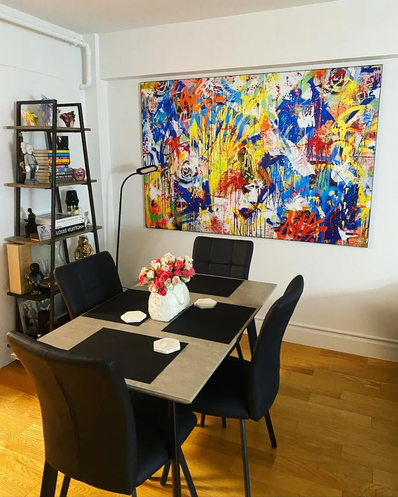
Yellow Graffiti is probably one of the easiest pieces in this collection to spot from across the room.
Blue, yellow, red, and green come together in a graffiti-inspired design that feels energetic and playful.
Why it works
Sometimes the room doesn’t need another subtle decoration.
It needs one thing that actually has some attitude.
This is that kind of piece.
Pros
- Very colorful
- High visual impact
- Great for creative spaces
- Can become the room’s main focal point
Something to keep in mind
I’d be careful about pairing it with another large, colorful statement piece.
Give it some space.
I’d choose it for:
A home office, studio, game room, creative workspace, or colorful modern interior.
8. Tai Chi — For a Proper Statement Wall
Starting price: around $165
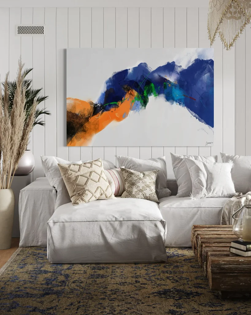
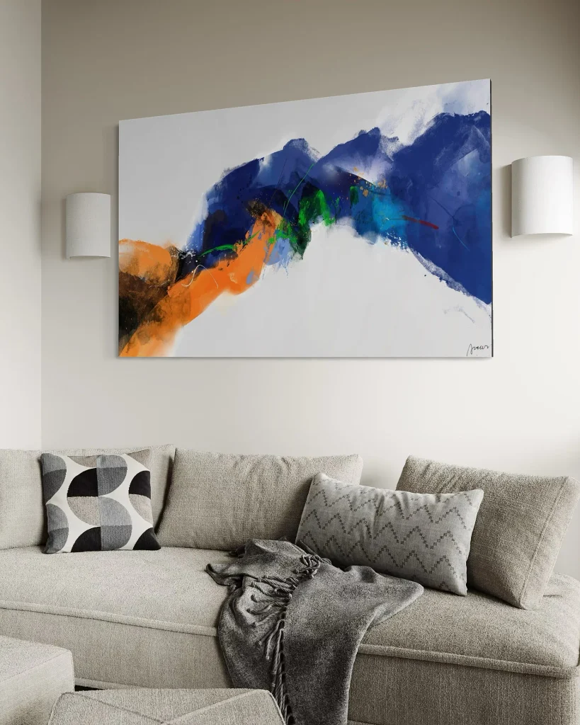
Tai Chi is another bold option, but it feels somewhat more controlled than Yellow Graffiti.
The strong blues and indigo are balanced by orange, green, and red accents.
Why it works
Blue and orange create a naturally noticeable contrast, so this piece can stand out even when the rest of your room is fairly simple.
Pros
- Strong focal-point potential
- Interesting warm/cool contrast
- Works well in modern spaces
- Suitable for larger walls
Something to keep in mind
Before buying a colorful piece like this, look around your room.
If there is absolutely no blue, orange, teal, or related color anywhere else, the artwork may feel disconnected.
I’d choose it for:
A living room, office, or open space with blue, teal, orange, charcoal, cream, or warm wood.
What Buyers Say


Calming & Coastal Abstract
Blues, horizontal flow, water-inspired movement. Best for bedrooms, bathrooms, or any space meant for winding down.
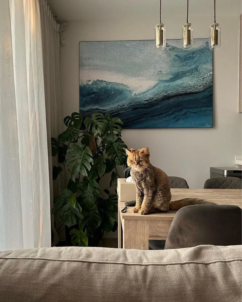
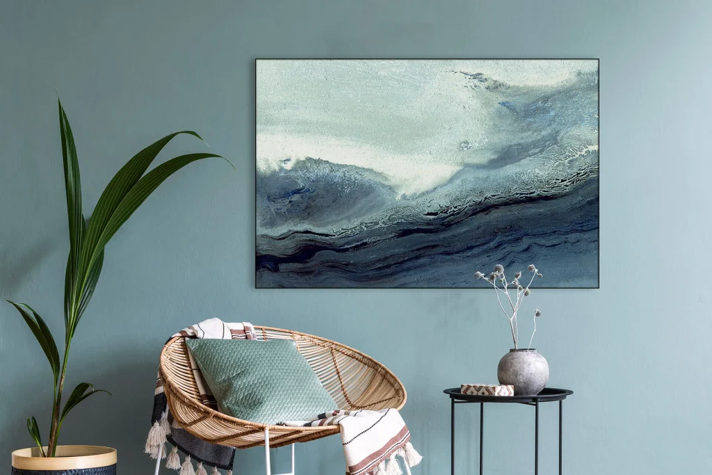
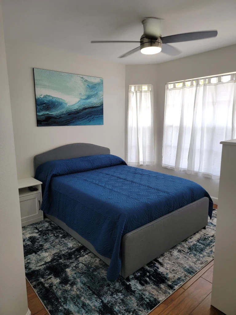
9. The Wave — My Pick for a Calmer Room
Starting price: around $165
If you’re decorating a bedroom and want the artwork to help the room feel relaxed, The Wave is a natural direction.
The artwork uses pale blues, deeper indigo, white, and flowing lines that give it a soft, wave-like movement.
Why it works
There’s something naturally calming about horizontal movement and cooler colors.
You don’t have to use it only in a bedroom, though. It can also work in a living room where you want a relaxed atmosphere.
Pros
- Calm color palette
- Relaxed visual movement
- Easy to pair with neutral furniture
- Works particularly well in bedrooms
Something to keep in mind
If your room is dominated by warm orange, red, and yellow, the cool palette may need some supporting colors elsewhere.
I’d choose it for:
A bedroom, relaxed living room, reading space, or coastal-inspired interior.
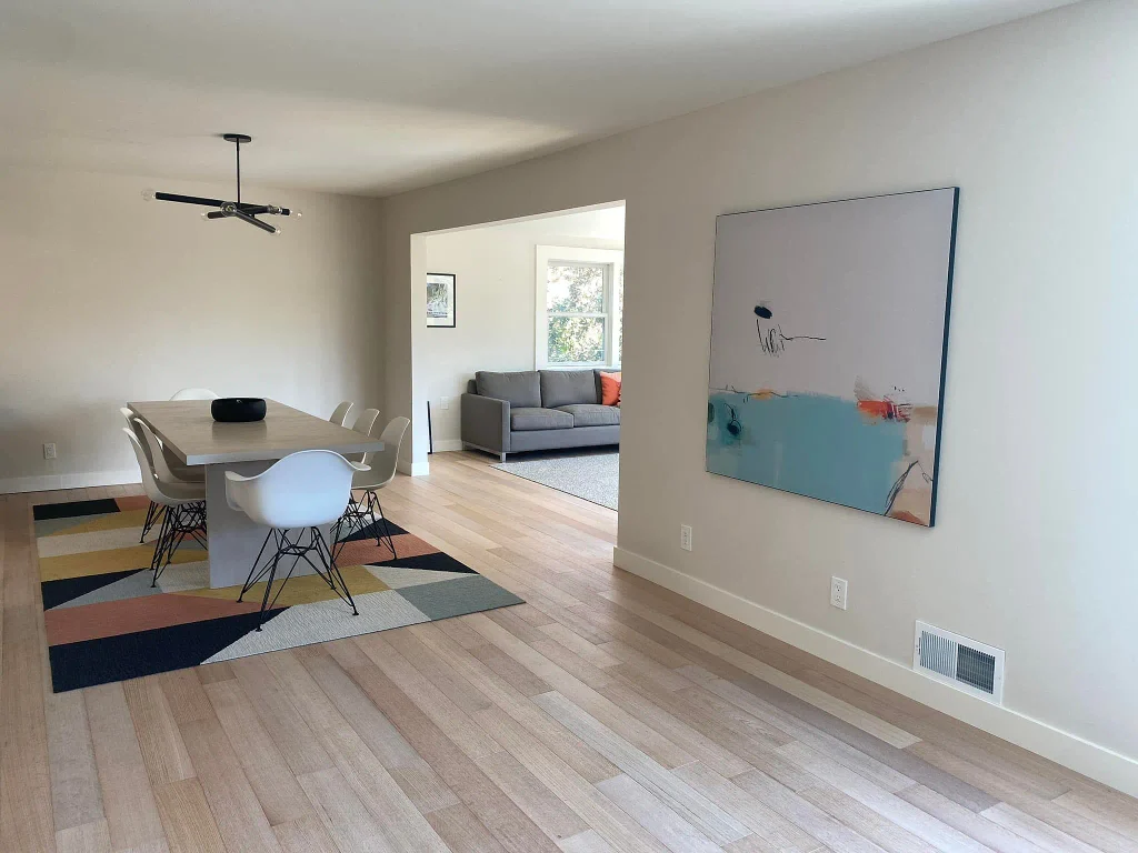
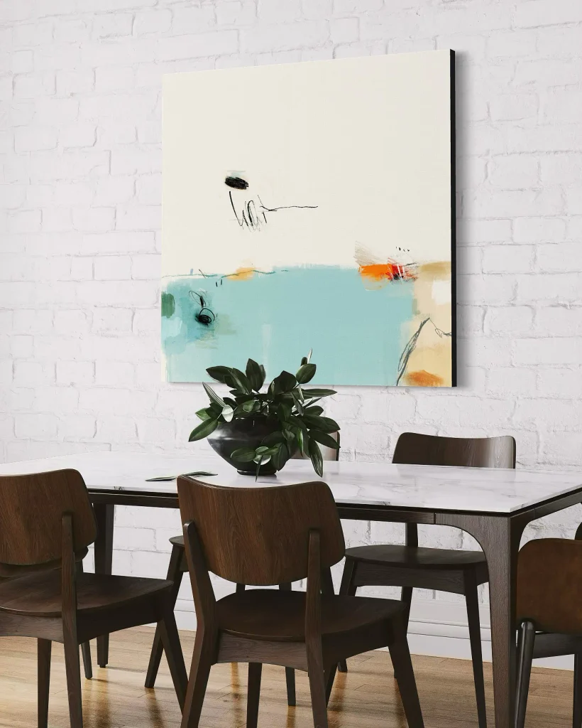
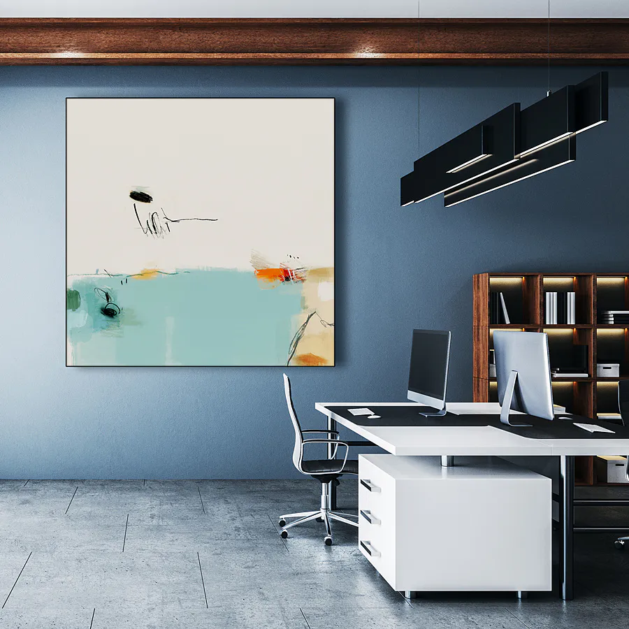
10. Sunny Weather in Kenting — A More Playful Coastal Option
Starting price: around $165
Sunny Weather in Kenting has a much more casual personality.
It combines teal with charcoal lines, orange accents, and loose marks that give it a hand-drawn quality.
Why it works
It doesn’t feel overly formal.
If you have a casual kitchen, creative workspace, reading corner, or relaxed living area, that can actually be an advantage.
Pros
- Playful composition
- Teal and orange work well together
- Casual artistic feel
- Good for less formal spaces
Something to keep in mind
I’d probably skip it for a room that has a very polished, formal, minimalist aesthetic.
I’d choose it for:
A kitchen, reading nook, casual office, bathroom, or creative space.
What Buyers Say



Emotional & Surreal Abstract
Figurative hints, mood-driven, open to interpretation. Best for a space that wants conversation, not just decoration.
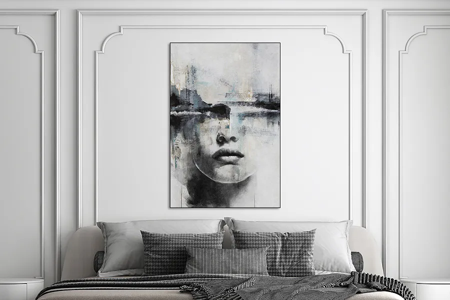
11. Abstract Harmony — If You Want People to Look Twice
Starting price: around $165
Abstract Harmony is quite different from the geometric and color-based pieces.
There’s a fragmented face within the artwork, surrounded by gray, white, and soft blue elements.
That gives it a slightly surreal, dreamlike quality.
Why it works
Some wall art is there simply to make the room look nicer.
Other pieces make people stop and ask, “What am I looking at?”
This one falls into the second category.
Pros
- Unusual design
- Strong conversation-piece potential
- Relatively restrained colors
- Works in modern interiors
Something to keep in mind
If you’re specifically looking for completely non-figurative abstract art, I’d choose one of the other pieces instead.
I’d choose it for:
An entryway, living room, bedroom, or hallway where you want the artwork to attract attention.
What Buyers Say



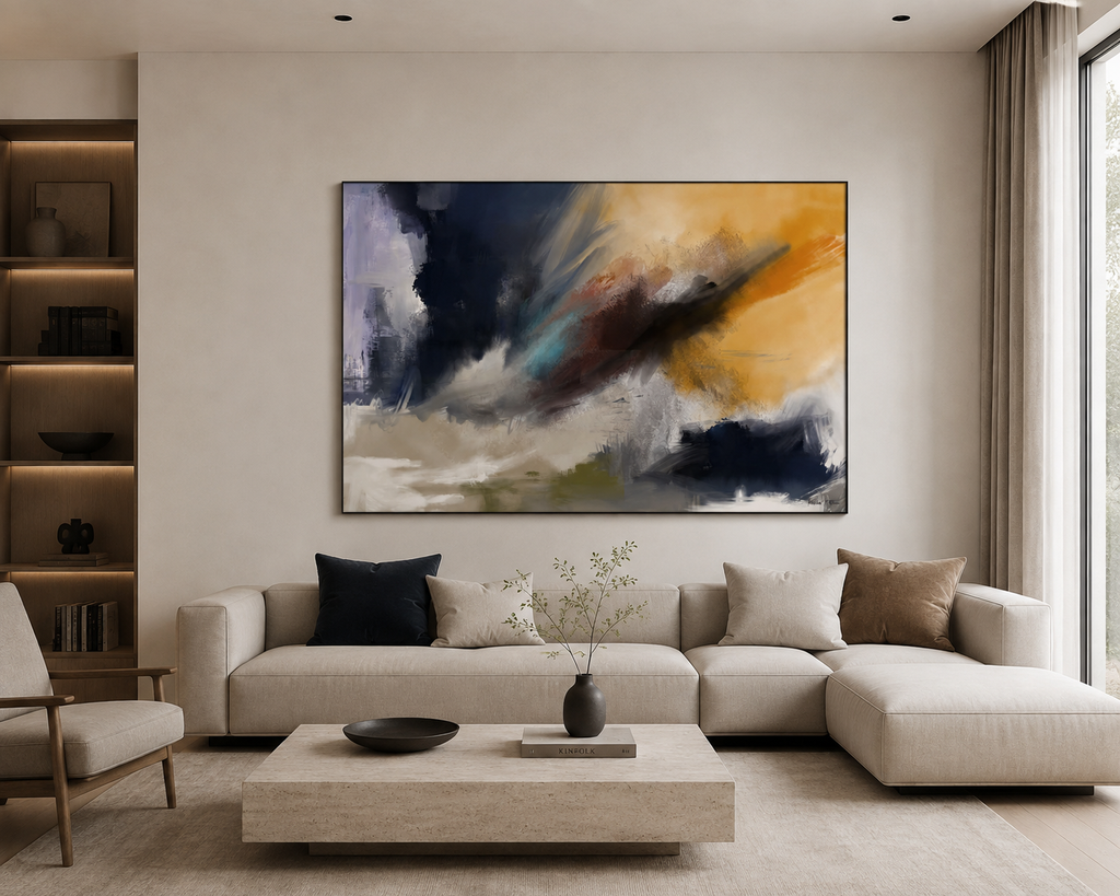
12. Until I Find You — For a Moodier, More Dramatic Look
Starting price: around $165
Until I Find You has a completely different mood from The Wave.
Instead of pale blues and soft movement, you get deeper navy and indigo combined with amber and sienna tones.
The brushwork gives the artwork a stormy, emotional feeling.
Why it works
This is the kind of piece I’d use when I want the wall to have some emotional weight.
It isn’t simply filling a space.
It’s becoming part of the room’s atmosphere.
Pros
- Dramatic color combination
- Strong focal point
- Works well with darker interiors
- Good for modern and moody spaces
Something to keep in mind
A dark, dramatic artwork can make a small room feel heavier, particularly if the furniture and walls are already dark.
I’d choose it for:
A living room or dining room with navy, charcoal, brown, amber, cream, or warm wood.
Contemporary Color-Block
Smooth gradients, wide horizontal flow, polished rather than raw. Best for open, modern spaces.
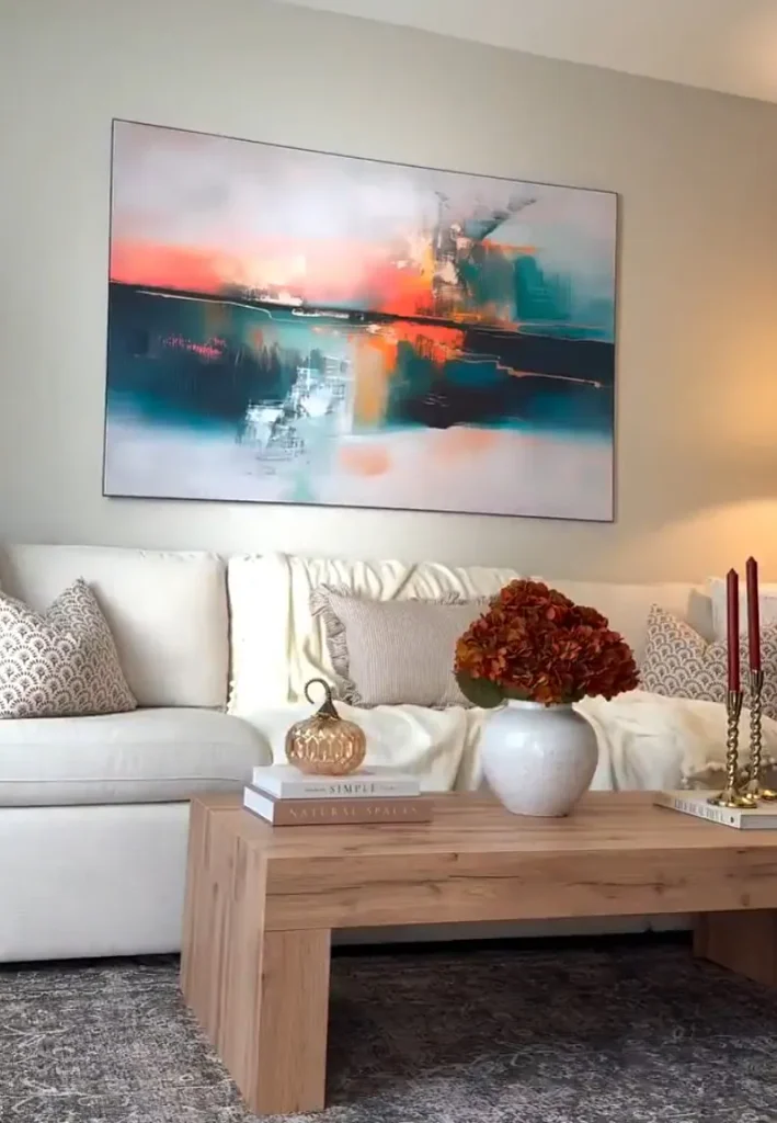
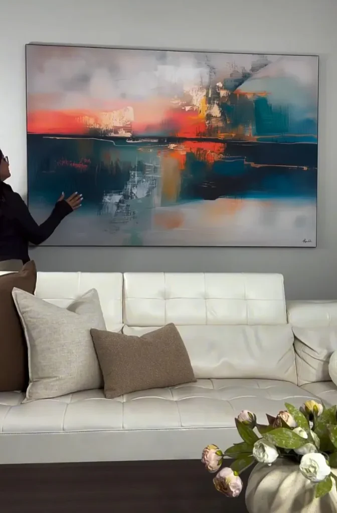
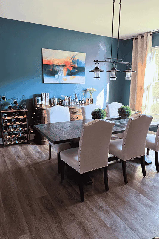
13. Infinity III — A Modern Choice Without Going Completely Overboard
Starting price: around $165
Infinity III uses coral, peach, teal, blue, and orange in a more controlled color-block composition.
It’s colorful, but the shapes and overall arrangement keep it from feeling as chaotic as some maximalist artwork.
Why it works
This is a good choice if your room needs some color, but you don’t want a piece that completely takes over.
Pros
- Contemporary color palette
- Warm and cool colors together
- Works well in open spaces
- Easy to use as a modern focal point
Something to keep in mind
I’d look for at least one or two related colors somewhere else in the room.
Even something small, such as a cushion or decorative object, can help connect the artwork to the rest of the space.
I’d choose it for:
A contemporary living room, home office, or open-concept space.
What Buyers Say



So, Which Style Should You Actually Choose?
This is probably the easiest way to narrow everything down.
If your room is warm and earthy
Look at Geo Formation or Pinnacle.
Think beige sofas, wood furniture, cream walls, tan rugs, and warm lighting.
If your room is minimalist
Go with Unwavering Willpower or Fusion.
These are easier to work into a room where you don’t want another strong color competing for attention.
If you want texture
Start with Macroscopic.
It’s a better fit when the rest of the room is relatively simple, and you need one substantial focal point.
If you want something calm
Look at The Wave.
Its cooler colors and flowing composition naturally lend themselves to relaxed spaces.
If you want color
Try Tai Chi, Yellow Graffiti, or Infinity III.
The difference is mainly how intense you want the result to feel.
If you want something unusual
Go for Abstract Harmony.
It’s much more likely to become a conversation starter than a generic geometric print.
If you want drama
Until I Find You is the obvious direction.
What Modern Abstract Wall Art Works Best in a Living Room?
Living rooms usually give you the most freedom because there’s often more wall space.
For a calm living room, I’d look at:
- The Wave
- Unwavering Willpower
- Fusion
For something warmer:
- Geo Formation
- Pinnacle
- Macroscopic
For a statement wall:
- Tai Chi
- Yellow Graffiti
- Until I Find You
The key is to decide whether you want the artwork to blend into the room or become the focal point.
Don’t try to make every object in the room equally noticeable.
What About the Bedroom?
Bedrooms usually benefit from artwork that doesn’t feel overly aggressive.
That’s why I’d start with:
Unwavering Willpower — if you like minimalism
The Wave — if you want a relaxed feel
Pinnacle — if you prefer earthy colors
Cellist — if you want some geometry without going too bright
A bedroom doesn’t necessarily need boring artwork. It just needs something that works with the mood you’re trying to create.
How Do You Pick the Right Colors?
Here’s a simple trick.
Stand in the room and identify the colors you already see most often.
Maybe it’s:
- Beige
- Walnut brown
- Cream
- Sage green
Or perhaps:
- Gray
- Black
- White
- Blue
You don’t have to find artwork containing every single one of those colors.
Usually, picking a piece that shares one or two important colors with the room is enough to make it feel connected.
And if you want the artwork to stand out, deliberately choose a contrasting accent color instead.
Read our Guide – How to Choose Wall Art Colors for Your Living Room: 9 Simple Rules
Don’t Forget About Size
This is where a lot of otherwise good wall-art choices go wrong.
You can find the most beautiful artwork in the world, but if it’s too small for the wall, it can still look awkward.
Before ordering, measure:
- The width of the wall
- The furniture underneath it
- The available vertical space
- Nearby windows and doors
- The distance between the furniture and ceiling
Then compare those measurements with the actual artwork dimensions.
If you’re placing art above a sofa, console, bed, or dining table, think about the relationship between the artwork and the furniture underneath it, not just the empty wall.
If you’re unsure, go back to the product page and check the available room previews and size options.
Read our Guide – How to Choose the Right Wall Art Size for a Living Room: 9 Simple Rules That Actually Work
Is Canvas, Acrylic, Metal, or ArtFab Better?
There isn’t one answer that works for everyone.
It mostly comes down to the look you’re after.
ArtFab
If you’re mainly interested in getting the artwork at its lowest listed entry configuration, this is a practical place to start comparing.
Canvas
Canvas can give artwork a softer, more traditional appearance and works naturally in many home interiors.
Acrylic
Acrylic tends to suit people who prefer a cleaner, more polished contemporary presentation.
Metal
Metal can work particularly well when you’re going for a sharper, modern aesthetic.
Before buying, compare the available finishes on the specific product page because not every configuration or finish will necessarily be available for every piece.
Is $165 a Good Starting Price?
The pieces in this collection currently start at around $165 in the entry configuration used for this guide.
But don’t assume every final order will cost exactly $165.
The final price can change depending on:
- Size
- Material
- Finish
- Frame
- Customization
- Promotions
- Current availability
If you’re trying to stay within a specific budget, compare the available configurations before you get attached to a particular size.
At the same time, don’t automatically buy the smallest version just because it’s cheaper.
A piece that looks great in a product photo can lose its impact completely if it’s undersized for your wall.
5 Things I’d Avoid When Buying Abstract Wall Art
1. Buying purely because it looks good online
Ask yourself whether it actually works with your room.
A beautiful artwork can still be the wrong choice.
2. Ignoring the wall size
Measure first.
Seriously.
It takes a few minutes and can save you from ending up with a tiny piece floating in the middle of a huge wall.
3. Trying to match every color
You don’t need an exact color match.
Repeating one or two colors is usually enough.
4. Putting too many statement pieces together
If you’ve already got a colorful rug, patterned sofa, large mirror, dramatic lighting, and bold artwork, something has to give.
Let one or two things lead visually.
5. Choosing the finish without thinking about the room
The same artwork can feel quite different depending on how it is presented.
Think about your furniture, lighting, wall color, and the overall style of the room before choosing the finish.
My Final Picks
If I had to narrow the entire collection down based on different decorating situations, here’s how I’d do it:
For a safe, warm choice: Geo Formation
For minimalism: Unwavering Willpower
For texture: Macroscopic
For earthy/coastal interiors: Pinnacle
For a calm bedroom: The Wave
For a bold statement: Tai Chi
For maximum color: Yellow Graffiti
For something unusual: Abstract Harmony
For a dramatic room: Until I Find You
For a contemporary space: Infinity III
The “best” piece really comes down to what you’re trying to do with the room.
If you want the artwork to quietly finish the space, stay with the minimalist and neutral options.
If you want guests to notice the wall as soon as they walk in, choose something more colorful or dramatic.
Which Style Fits Which Room
| Room | Best-Fit Styles |
|---|---|
| Living Room | Geometric, Textured, Bold, Emotional |
| Bedroom | Minimalist, Calming & Coastal |
| Home Office | Geometric, Bold, Contemporary |
| Dining Room | Minimalist, Emotional & Surreal |
| Kitchen / Bathroom | Calming & Coastal |
How to Style Abstract Wall Art
Pick the piece’s dominant color before the piece’s style — a bold, maximalist piece in colors that already exist in your room (a rug, a throw pillow, curtains) will feel intentional. The same piece in a totally unrelated color palette can feel like it was dropped in at random. If you’re not sure which way to go, a piece with a neutral base and one accent color (like Macroscopic or Pinnacle) is the safest bridge between “too plain” and “too much.”
For scale: a single large abstract piece almost always reads better than two or three smaller ones split across a wall — this is the one rule that applies across every style on this list.
Want the Short Version? Here Are My Top Picks
If you don’t feel like going through all 13 pieces right away, here’s where I’d start.
Best for warm, earthy rooms: Geo Formation
Best minimalist option: Unwavering Willpower
Best textured piece: Macroscopic
Best coastal look: The Wave
Best bold artwork: Yellow Graffiti
Best dramatic piece: Until I Find You
Best contemporary color combination: Infinity III
Best conversation piece: Abstract Harmony
There isn’t really one “best” piece for everyone. Your wall, furniture, lighting, and existing colors matter just as much as the artwork itself.
Before You Buy: How I Looked at These Pieces
I didn’t want this to become another article where every product is called “stunning,” “beautiful,” or “perfect for any room.”
That’s not particularly helpful when you’re actually trying to spend $165 or more on wall art.
Instead, I looked at things that matter when you’re choosing artwork for a real home:
- What colors does the piece bring into the room?
- Is it calm or visually intense?
- Does it work better as a background piece or a focal point?
- Which rooms make the most sense for it?
- What kind of furniture could it work with?
- Is the design easy to live with, or could you get tired of it?
- Would it work with a modern, minimalist, earthy, coastal, or more eclectic interior?
I haven’t physically tested every artwork in my own home, so I won’t pretend otherwise. This is a visual and editorial comparison based on the artwork and product information available at the time of writing.
Prices, sizes, finishes, and availability can also change, so double-check those details before placing an order.
FAQs
What is the best modern abstract wall art for a living room?
There isn’t one universal winner. Geo Formation and Macroscopic are good starting points for warm interiors; The Wave works well for a calmer room, while Tai Chi and Until I Find You make more sense if you want a stronger focal point.
How much does the artwork cost?
The pieces featured in this guide start at around $165 in the entry configuration used at the time of writing. Larger sizes and different finishes may cost more.
Will every size cost $165?
No. Think of $165 as the starting price rather than the price for every configuration. Check the individual product page for the current price of your preferred size and finish.
How do I know what size to buy?
Measure your wall and the furniture underneath it first. Then compare those measurements with the artwork dimensions shown on the product page.
Should wall art match my sofa?
It doesn’t have to match exactly. In fact, exact matching can sometimes make a room feel overly coordinated. Picking up one or two existing colors is usually a better approach.
Is abstract wall art good for a bedroom?
Absolutely. For bedrooms, I’d generally lean toward calmer designs such as Unwavering Willpower or The Wave, although the right choice depends on your personal style.
Which abstract artwork is best for a minimalist home?
Unwavering Willpower and Fusion are natural starting points because their more restrained palettes don’t introduce too many competing colors.
Which artwork is best if I want something colorful?
Yellow Graffiti is one of the strongest choices for maximum color, while Tai Chi and Infinity III offer colorful alternatives with somewhat more structure.
Is canvas better than acrylic?
Neither is automatically better. Canvas can create a softer, more traditional feel, while acrylic can work nicely in sleek contemporary interiors. Your room and personal preference should decide.
Can I choose a larger size?
Size availability depends on the specific artwork. Check the individual product page for the current options before purchasing.
Are prices and availability permanent?
No. Product pricing, available sizes, finishes, promotions, and availability can change. Always verify the current details before ordering.
The Bottom Line
Buying modern abstract wall art doesn’t have to be complicated.
Start with the room you already have.
Look at the colors, measure the wall, decide whether you want something calm or dramatic, and then choose an artwork that supports that direction.
If you want something warm and easy to style, start with Geo Formation.
If you’re after a cleaner minimalist look, check Unwavering Willpower.
If you want your artwork to become the main feature of the room, look at Tai Chi, Yellow Graffiti, or Until I Find You.
And if you simply want something that feels different from the usual abstract prints, Abstract Harmony is worth a closer look.
The goal isn’t to buy the artwork that looks best in a product thumbnail.
The goal is to find the piece that makes your actual room look better.
Disclosure: This article contains affiliate links to products sold on BIG Wall Décor. If you purchase through these links, this site may earn a commission at no extra cost to you. Prices and availability shown above are accurate as of publishing but are subject to change — always check the current price and size options on the product page before purchasing. See our full Affiliate Disclosure for more information.


3 Comments