Best Japanese Wall Art for Modern Homes in 2026: 7 Minimal Designs Worth Buying
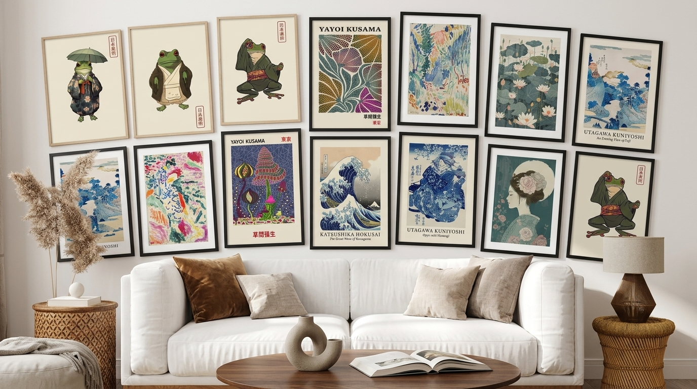
Japanese wall art doesn’t try to fill a wall. It tries to leave it alone.
That’s the real difference between it and most “minimalist” decor you’ll find online. Generic minimalist prints tend to be empty for the sake of being empty — a single line, a beige blob, nothing to hold onto. Japanese wall art is quiet for a reason: it’s built on centuries of design principles like ma (negative space) and wabi-sabi (beauty in imperfection and impermanence), where the space around a mountain, a wave, or a single branch is just as intentional as the subject itself.
That’s also why it works so well in modern homes. A wave study by Hokusai, a soft ink-wash mountain range, or a single geisha portrait against pale linen doesn’t compete with your furniture — it grounds the room around it. But getting the effect right depends on choosing the right piece, the right size for your wall, and the right palette for your existing decor, and that’s where most people get stuck.
This guide walks through what actually makes Japanese wall art work in a modern interior, how to choose size, framing, and placement, and which designs from our featured collection are genuinely worth considering for a living room, bedroom, or home office.
At a Glance: Quick Picks
| Best For | Recommended Pick | Style | Ideal Room |
|---|---|---|---|
| Best Overall | The Great Wave of Kanagawa Set | Traditional Ukiyo-e | Living Room |
| Best Minimalist Pick | Japanese Garden Set of 3 | Abstract, muted botanical | Living Room, Office |
| Best Nature-Inspired Design | Lilies on the Water Set | Soft landscape, pastel | Bedroom, Living Room |
| Best Statement Wall | Yayoi Kusama Sage Green Set | Contemporary abstract | Living Room, Studio |
| Best Bold Color Pop | Colorful Kusama Museum Art Set | Contemporary pop art | Living Room, Office |
| Best Conversation Piece | Yayoi Kusama Famous Wall Art Set | Contemporary graphic | Living Room |
| Best Playful/Budget-Friendly | Matsumoto Hoji Frog Set | Traditional woodblock, whimsical | Kids’ Room, Entryway |
What Makes Japanese Wall Art Unique?
What is Japanese wall art? It’s artwork rooted in Japanese aesthetic traditions — ukiyo-e woodblock prints, sumi-e ink landscapes, botanical studies, or contemporary Japanese-influenced abstraction — built around restraint, asymmetry, and negative space rather than dense, busy compositions.
Most “minimalist wall art” is minimal because it has little to say. Japanese wall art is minimal because it’s editing itself down to what matters — a wave, a mountain, a single flowering branch — and trusting the surrounding space to do the rest.
That’s a useful distinction if you’re shopping for it. A generic geometric line-art print can feel cold or interchangeable. A well-chosen Japanese landscape or woodblock-style print tends to feel intentional even in a very plain room, because the composition itself is doing the work.
It’s also why Japanese-inspired wall art pairs so naturally with Japandi interiors — the Japanese-Scandinavian hybrid style built on natural materials, muted palettes, and uncluttered layouts. If your home already leans toward that aesthetic, Japanese wall art isn’t an accent; it’s close to a foundation piece.
How to Choose Japanese Wall Art for a Modern Home
Design: what to actually look for
Before color or size, decide what kind of imagery fits your space:
- Landscapes and nature — mountains, waves, lotus ponds, cherry blossoms. Calming, versatile, and easy to live with long-term.
- Traditional motifs — ukiyo-e woodblock reproductions (Hokusai, Hiroshige-style), geisha portraits, koi. Strong visual identity; works best as a focal point rather than background decor.
- Contemporary Japanese-influenced abstraction — bold graphic pieces like Yayoi Kusama–style prints. More of a statement than a backdrop; use when you want the art to lead the room.
- Playful or whimsical designs — stylized animal prints or folk-art reinterpretations. Good for adding personality to an otherwise serious, neutral space.
None of these is more “correct” than the others — the right choice depends on whether you want the art to blend in or stand out.
Color palette
Japanese wall art doesn’t live in one color story. You’ll find:
- Neutral and muted tones (beige, cream, soft grey) for Japandi and Scandinavian-leaning rooms
- Indigo and deep blue for a more traditional, moodier feel — especially wave and water-themed pieces
- Black and white for high-contrast, graphic impact
- Soft green and pastel for nature-inspired, botanical-leaning sets
- Bold, saturated color (as in contemporary Kusama-style work) when the art is meant to be the room’s focal point
Match the palette to your existing furniture and walls before you match it to “what looks Japanese” — a print that’s technically on-theme but clashes with your sofa will always look wrong.
Size
Undersized art is the single most common mistake. A small print on a large, empty wall reads as an afterthought, no matter how good the piece is on its own.
As a rough guide:
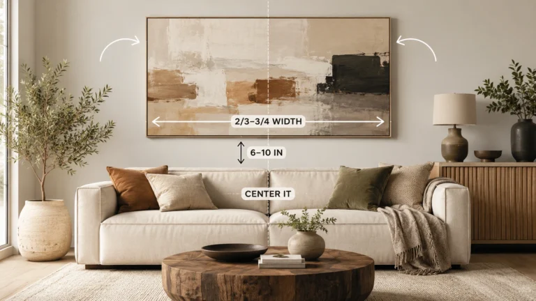
- Above a sofa or console: the art (or full set, if multi-panel) should span roughly 60–75% of the furniture’s width
- On an open wall with no furniture reference: allow at least 4–6 inches between the top of the art and the ceiling line, and avoid isolating a small print in a large expanse of wall
Not Sure What Size Japanese Wall Art You Need?
Sizing a single statement piece is one thing — sizing a 3-panel set for a specific wall is harder, since spacing between panels changes the effective footprint. Rather than guess, run your wall dimensions through our Wall Art Size Calculator to get a size range that actually fits your space before you buy.
Orientation
- Horizontal/panoramic pieces suit wide walls, above sofas, or long hallway runs
- Vertical pieces work well beside doorways, in narrow alcoves, or flanking a bed
- Multi-panel sets (like most of the picks below) give you flexibility — you can run them horizontally as a single wide statement, or stack/stagger them vertically on a narrower wall
Framing
- Framed prints feel more finished and are the safer choice for living rooms and formal spaces
- Canvas adds texture and a slightly more casual, gallery feel, with no glass reflection to worry about
- Unframed prints are the most affordable route if you already own frames or want to customize your own gallery wall
Which room does it suit?
- Living room — landscapes, waves, and larger multi-panel sets as a focal wall
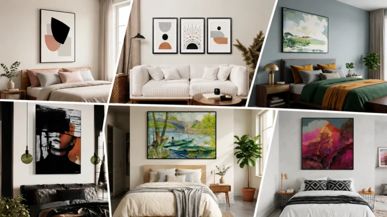
- Bedroom — softer, nature-inspired pieces in muted palettes; avoid overly graphic or high-contrast art directly above the headboard
- Home office — minimalist or botanical designs that support focus rather than compete for attention
- Entryway — smaller, high-impact pieces (a single wave or graphic print) that make a strong first impression
- Dining area — nature or botanical sets that feel calm during long periods at the table
The 7 Best Japanese Wall Art Picks
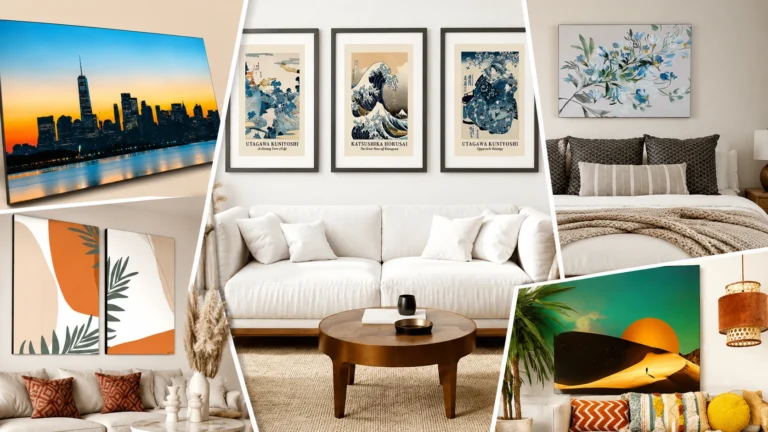
[IMAGE PLACEHOLDER — Section image: overview grid of the 7 featured Japanese wall art sets]
1. The Great Wave of Kanagawa Set
Best for: A confident, recognizable focal point
Style: Traditional ukiyo-e woodblock
Ideal room: Living room, home office
Recommended placement: Above a sofa, console, or as the anchor of a reading nook
Suggested size: Scale each panel so the full set spans roughly two-thirds of the furniture beneath it — check the product page for the exact size options available
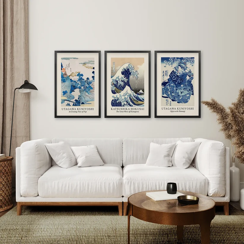
Hokusai’s Great Wave is one of the most recognizable images in art history, and that familiarity is part of its appeal — it reads as intentional and confident rather than generic. The bold blue-and-white palette gives it presence without relying on saturated color, which is why it works in rooms that otherwise lean neutral.
Because it’s such a well-known composition, it suits buyers who want a clear point of visual interest rather than a purely background piece. It’s less suited to already-busy rooms, where its graphic strength can start to compete with other elements instead of anchoring them.
Why we like it
- Instantly recognizable without feeling like a cliché reproduction
- Strong blue-and-white palette that pairs with both neutral and indigo-leaning rooms
- Works as a genuine focal point in living rooms and offices alike
Potential drawback
- Its visual strength means it doesn’t disappear into the background — skip it if you want quieter, more ambient art
2. Lilies on the Water Set
Best for: Soft, restful bedroom or living room styling
Style: Traditional Japanese landscape, pastel palette
Ideal room: Bedroom, living room
Recommended placement: Above a bed (off-center from the headboard), or grouped in a reading corner
Suggested size: Individual panels sized modestly (roughly 12×16 to 16×20 depending on wall) tend to read as intentionally gentle rather than sparse — confirm exact dimensions on the product page
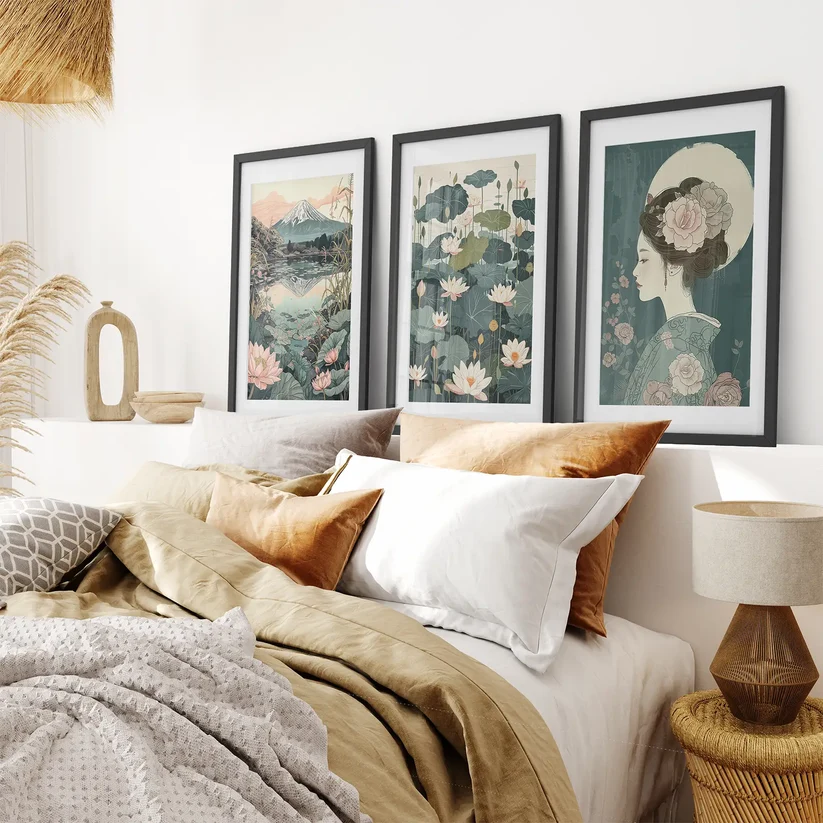
This three-print set pairs a geisha portrait, a lotus pond, and a Mount Fuji landscape in soft pastel tones — a combination that leans traditional without feeling heavy or dark. It’s one of the more versatile picks here precisely because the palette is so gentle.
It suits buyers who want the calming association of Japanese landscape art without introducing strong contrast or saturated color into a room. Because the tones are soft, it works particularly well in bedrooms, where you don’t want art competing with rest.
Why we like it
- Pastel palette suits bedrooms and calm, low-contrast living rooms
- Combines three traditional motifs (portrait, water, mountain) in one coordinated set
- Reads as serene rather than sparse
Potential drawback
- The soft palette can feel underwhelming on a very large or high-contrast wall — better suited to mid-sized walls than a dramatic oversized statement.
3. Japanese Garden Set of 3 Posters
Best for: A minimalist, Japandi-leaning living space
Style: Abstract botanical, Matisse-influenced
Ideal room: Living room, home office
Recommended placement: A neutral feature wall, or above a low sideboard
Suggested size: Works well as three evenly spaced mid-sized panels rather than one oversized print — check the listing for exact dimensions
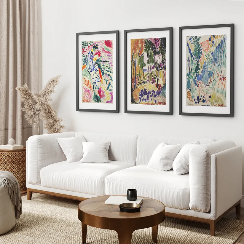
This set takes a looser, more abstract approach to a Japanese garden theme, with an eclectic, Matisse-influenced style rather than a literal landscape. The result sits closer to modern gallery art than traditional woodblock work, which makes it an easier fit for contemporary or Japandi-style rooms that want a nod to the theme without leaning fully traditional.
It’s a strong option for buyers who like the idea of Japanese-inspired art but want something that reads as current rather than historical. It’s a weaker fit if you specifically want recognizable, traditional imagery like a wave or mountain scene.
Why we like it
- Abstract, modern take that fits minimalist and Japandi interiors especially well
- Works as a neutral backdrop rather than a dominant focal point
- Suits rooms that already mix in other design influences
Potential drawback
- Buyers looking for classic, unmistakably “Japanese” imagery may find this too abstract
4. Yayoi Kusama Sage Green Set of 3
Best for: A calmer, more grounded contemporary statement
Style: Contemporary Japanese abstract
Ideal room: Living room, studio, creative workspace
Recommended placement: A single feature wall where the muted green-and-black palette can stand on its own
Suggested size: Best treated as a genuine focal wall rather than a background accent — size up rather than down
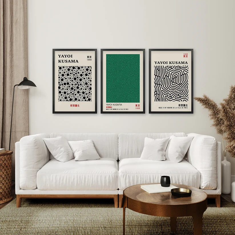
This set brings Kusama’s iconic style into a more restrained sage-green-and-black palette, which makes it noticeably easier to place in a modern home than the more saturated versions of her work. It keeps the graphic, contemporary energy while staying compatible with earthy, neutral color schemes.
It’s well suited to buyers who want a recognizable, gallery-style piece but don’t want to build a whole room around a bright color palette. It’s a poor match for very traditional or rustic interiors, where the graphic abstraction will feel out of place.
Why we like it
- Muted sage-green palette is easier to integrate into existing neutral decor than brighter Kusama-style prints
- Contemporary and graphic without being visually loud
- Suits apartments and smaller living spaces that still want a statement wall
Potential drawback
- Still a strong style statement — not ideal if you want art that recedes into the background
5. Colorful Yayoi Kusama Museum Art Set
Best for: A bold pop of color in an otherwise neutral room
Style: Contemporary pop art
Ideal room: Living room, home office
Recommended placement: A single wall that can support strong color without visual competition from nearby furniture or art
Suggested size: A large-format canvas option (if available on the listing) suits open living spaces better than a small print run
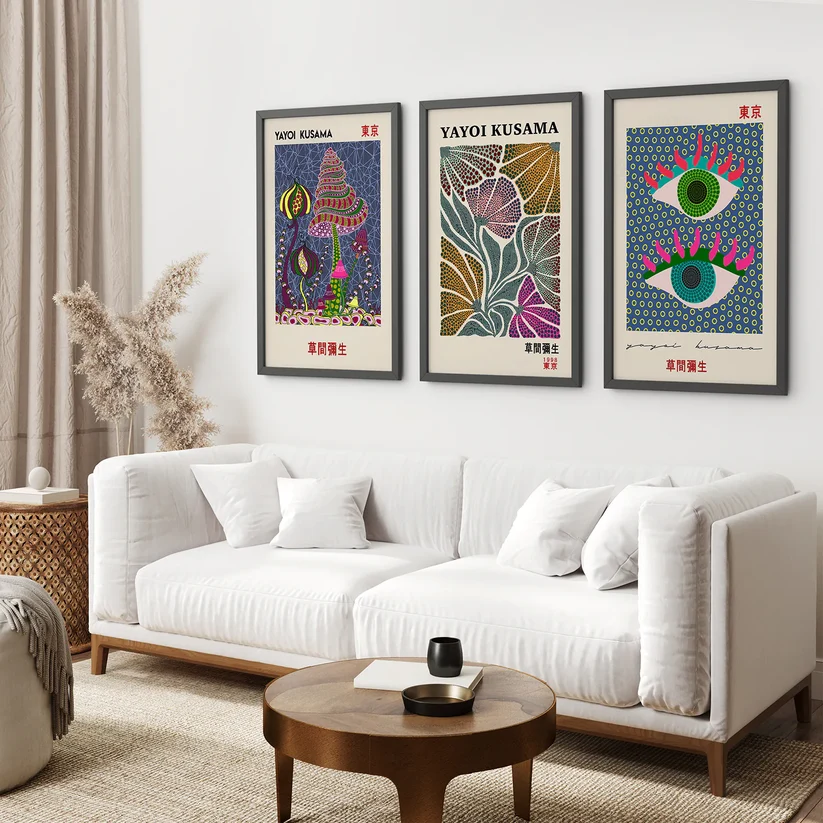
Where the sage-green set plays it safer, this version leans into Kusama’s signature saturated color and pattern work. It’s a genuine statement piece, best suited to a room that’s otherwise fairly neutral and can absorb a strong pop of color without feeling cluttered.
This is the pick for buyers who specifically want their wall art to be the first thing people notice in the room — not a supporting piece, but the focal point the rest of the decor is built around.
Why we like it
- Bold, unmistakably contemporary color palette
- Strong option for buyers who want art to be a genuine centerpiece
- Recognizable “museum art” appeal for gallery-style rooms
Potential drawback
- Requires a fairly neutral room around it to avoid visual overload
6. Yayoi Kusama Famous Wall Art Set
Best for: Buyers who want Kusama’s most recognizable motif specifically
Style: Contemporary graphic
Ideal room: Living room
Recommended placement: A dedicated feature wall, ideally with minimal competing decor
Suggested size: Sized to match the scale of the wall rather than the furniture beneath it — this set works best as a full-wall moment
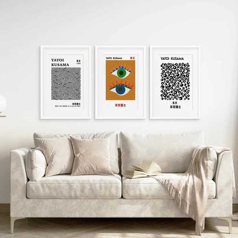
This set leans into one of Kusama’s most iconic and widely recognized motifs, making it a good fit for buyers specifically drawn to her work rather than Japanese art more broadly. It sits close to pop art in feel, and works best when treated as the single dominant piece in a room.
It’s a strong option for a modern apartment or a creative studio space, less so for a traditional or heavily patterned room where it would have to compete for attention.
Why we like it
- Clear, recognizable connection to one of contemporary art’s most iconic motifs
- Works well as a genuine conversation piece
- Graphic style pairs naturally with modern, minimalist furniture
Potential drawback
- Very much a statement piece — not a flexible “fits anywhere” option
7. Matsumoto Hoji Frog Wall Art Set
Best for: Adding personality without abandoning the Japanese theme
Style: Traditional woodblock-inspired, whimsical
Ideal room: Entryway, kids’ room, playful home office
Recommended placement: A smaller wall or hallway where a lighter tone is welcome
Suggested size: Smaller-format prints suit this set better than an oversized statement wall — check the product listing for options
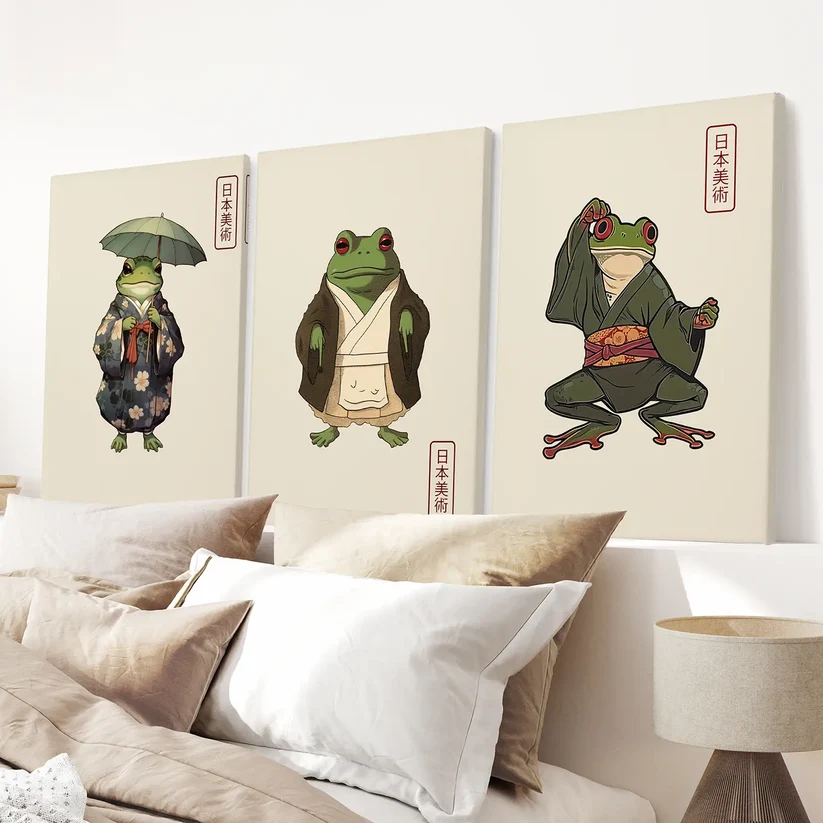
Based on traditional frog-in-kimono imagery, this set is the most overtly playful pick in this list, and it earns its place by being genuinely well executed rather than novelty for its own sake. It keeps a woodblock-inspired aesthetic while introducing humor, which makes it useful for spaces that need a little levity.
It suits buyers who want to nod to Japanese art traditions without their whole room feeling formal or serious. It’s not the right choice if you’re building a strictly minimalist or moody Japandi space — the whimsy works against that goal.
Why we like it
- Genuinely distinctive design that stands out from typical minimalist prints
- Traditional woodblock style keeps it visually connected to the rest of the theme
- Works well as a lighter accent in an entryway or playroom
Potential drawback
- Its playful tone doesn’t suit strictly formal or heavily minimalist Japandi rooms
Can’t Decide Which Style Fits Your Room?
If you’re weighing a traditional landscape against a bold Kusama-style abstract, or wondering whether a softer botanical set would work better in your space, use our Wall Art Finder to narrow down the direction before you commit to a specific set.
Comparison: The 7 Picks at a Glance
| Pick | Best For | Style | Room | Size Consideration |
|---|---|---|---|---|
| Great Wave of Kanagawa | Confident focal point | Traditional ukiyo-e | Living room, office | Full set spans ~2/3 of furniture width |
| Lilies on the Water | Calm, restful styling | Traditional landscape | Bedroom, living room | Works well at modest, gentle scale |
| Japanese Garden Set | Minimalist/Japandi rooms | Abstract botanical | Living room, office | Evenly spaced mid-sized panels |
| Kusama Sage Green | Grounded statement wall | Contemporary abstract | Living room, studio | Size up — treat as a full feature wall |
| Kusama Colorful Museum Set | Bold color centerpiece | Contemporary pop art | Living room, office | Best on a large, otherwise neutral wall |
| Kusama Famous Wall Art | Iconic motif specifically | Contemporary graphic | Living room | Scale to the wall, not just the furniture |
| Matsumoto Hoji Frogs | Playful accent | Traditional woodblock, whimsical | Entryway, kids’ room | Smaller format works best |
Japanese Wall Art by Room
Living room: This is where most of these picks perform best — either as a single confident focal point (the Great Wave, either Kusama set) or as a calmer backdrop (the Japanese Garden set). See our modern living room wall art ideas and living room gallery wall layouts for placement inspiration beyond a single wall.
Bedroom: Favor the softer, pastel-toned pieces like the Lilies on the Water set. Avoid hanging high-contrast graphic art directly above the headboard — it works better on a side or opposite wall. For more direction, see our guide to canvas prints for bedrooms.
Home office: Minimalist and botanical designs support focus better than bold pop-art pieces. The Japanese Garden set, or a smaller Kusama sage-green print, both work well here.
Entryway: A single, smaller, high-impact piece — the frog set or a single wave print — makes a stronger first impression than a full multi-panel gallery in a tight space.
Dining area: Nature-based sets in muted palettes suit long periods spent at the table better than high-contrast graphic art, which can start to feel overstimulating.
Japanese Wall Art by Interior Style
- Minimalist: Japanese Garden Set, Lilies on the Water
- Japandi: Japanese Garden Set, Kusama Sage Green Set — both lean neutral and grounded
- Scandinavian: Lilies on the Water Set pairs naturally with light wood and soft neutrals; see our wall art colors for living rooms guide for palette pairing
- Modern/contemporary: Either Kusama set, or the Great Wave for a bolder graphic anchor
- Neutral interiors: Lilies on the Water or Kusama Sage Green, both of which sit comfortably against beige, cream, and warm white walls
How to Hang and Style Japanese Wall Art
- Leave breathing room. Don’t crowd a Japanese-inspired piece with too much surrounding decor — the negative space around the art is part of the design.
- Match eye level, not ceiling height. Center multi-panel sets around eye level (roughly 57–60 inches from the floor to the center of the piece), not the middle of the wall.
- Pair with natural materials. Light wood, linen, and stone finishes reinforce the aesthetic far more effectively than glossy or heavily patterned surfaces.
- Don’t over-light it. Soft, indirect lighting suits the calm tone of most of these pieces better than a harsh, direct spotlight.
- Check your hanging height against your furniture, not just the wall, using our guide to hanging wall art above a sofa if you’re placing a set above seating.
- If you’re deciding between canvas, framed, or unframed, our canvas vs. framed print comparison covers the trade-offs in more depth.
Which Japanese Wall Art Should You Buy?
- By room: Living room → Great Wave of Kanagawa or a Kusama set. Bedroom → Lilies on the Water.
- By style: Minimalist/Japandi → Japanese Garden Set. Bold/contemporary → Colorful Kusama Museum Set.
- By wall size: Large open wall → Kusama Colorful Museum Set or the Great Wave. Smaller wall → Matsumoto Hoji Frog Set or a scaled-down Lilies on the Water.
- By palette: Neutral/earthy → Japanese Garden Set or Kusama Sage Green. Bold color → Colorful Kusama Museum Set.
If you only take away two picks from this guide: choose the Great Wave of Kanagawa set if you want a confident, timeless focal point, and the Japanese Garden Set if you want something quieter that still reads as intentional.
FAQs
What is Japanese wall art?
Japanese wall art is artwork drawing on Japanese aesthetic traditions — from ukiyo-e woodblock prints and sumi-e landscapes to contemporary Japanese-influenced abstraction — typically built around restraint, negative space, and asymmetry rather than dense, busy compositions.
What colors work best with Japanese wall art?
Neutral, earthy, and indigo tones suit traditional and Japandi-leaning rooms, while bold contemporary pieces (like Kusama-style prints) work best in a more understated, neutral room that can absorb the color. There’s no single “correct” palette — it depends on the mood you want.
Where should Japanese wall art be placed?
Living rooms and home offices suit bolder, more graphic pieces as a focal point. Bedrooms suit softer, pastel-toned landscapes placed away from direct eye level above the headboard. Entryways work well with a single smaller, high-impact piece.
What size Japanese wall art should I choose?
Size to your furniture, not just your wall — art above a sofa or console should span roughly 60–75% of that furniture’s width. For multi-panel sets, use our Wall Art Size Calculator to account for spacing between panels.
Is Japanese wall art suitable for minimalist interiors?
Yes — arguably more naturally than most other art styles, since Japanese design principles already prioritize negative space and restraint, which are the foundations of minimalist decor.
Does Japanese wall art work with Japandi interiors?
Yes. Japandi is a direct blend of Japanese and Scandinavian design, so muted, nature-inspired Japanese wall art (rather than bold graphic pieces) tends to be the most natural fit.
What’s the difference between Japanese and Japandi wall art?
Japanese wall art draws directly from Japanese artistic traditions — woodblock prints, ink landscapes, traditional motifs. Japandi wall art is a broader, more contemporary hybrid aesthetic that borrows Japanese restraint and pairs it with Scandinavian minimalism, often in more abstract or graphic forms.
Should Japanese wall art be framed or unframed?
Framed prints suit formal living rooms and give a more finished look. Canvas adds texture without glass reflection. Unframed prints are the most budget-friendly if you already have frames or want to build a custom gallery wall.
Affiliate disclosure: Some links below are affiliate links. If you buy through one, we may earn a small commission at no extra cost to you — this doesn’t affect which pieces we recommend.
Prices, sizes, and availability shown on linked product pages are set by the retailer and may change — check the listing for current details before purchasing.