
How to Choose Wall Art Colors for Your Living Room: 9 Simple Rules
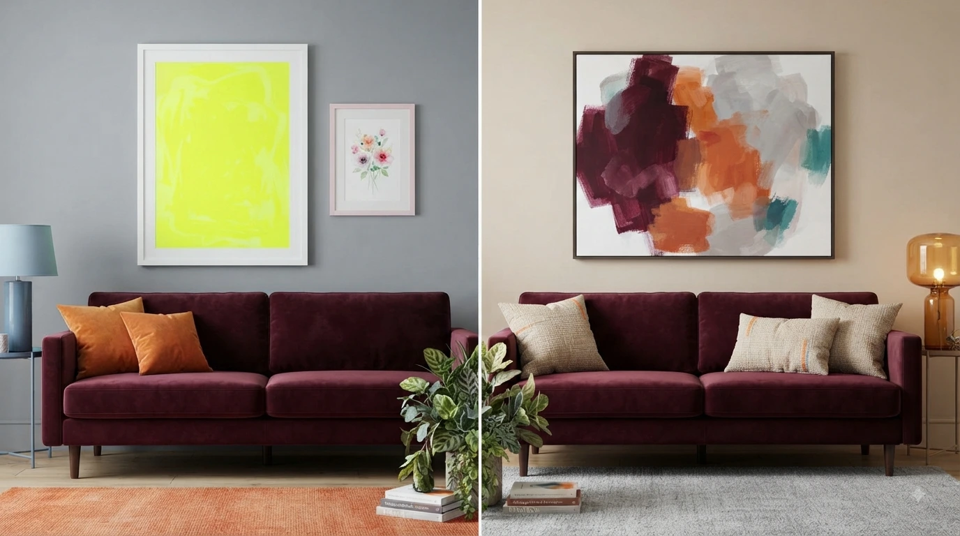
Picking the wrong wall art colors can make even a well-designed living room feel off. The right colors, though, tie the whole space together instantly.
This guide breaks down exactly how to choose wall art colors for living room spaces — with tables, quick tips, and zero guesswork.
Quick Summary: Wall Art Color Cheat Sheet
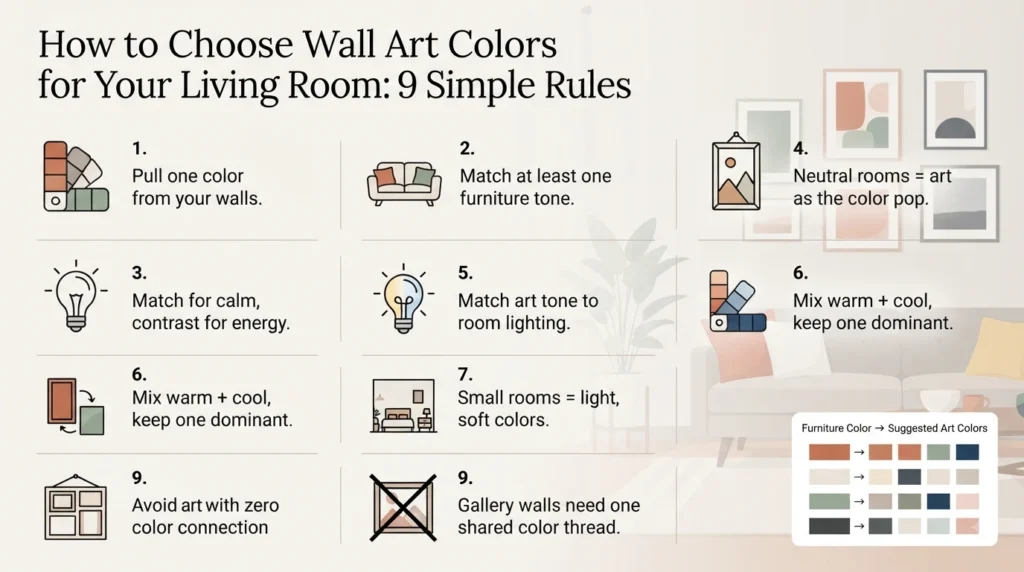
| Rule | Quick Tip |
|---|---|
| 1. Wall Color | Pull 1 accent color from art to echo on walls |
| 2. Furniture Match | Match at least one furniture tone in the art |
| 3. Match vs Contrast | Contrast adds energy; match adds calm |
| 4. Neutral Rooms | Use bold or warm colors as the focal point |
| 5. Lighting | Warm light needs warm-toned art, and vice versa |
| 6. Mixing Tones | Mix warm + cool, but keep one dominant tone |
| 7. Small Rooms | Light, soft colors keep the space open |
| 8. Gallery Walls | Pick one shared color thread across all pieces |
| 9. Common Mistakes | Avoid art with zero color connection to the room |
What Wall Art Colors Should You Choose Based on Your Wall Color?
Choose art that pulls at least one color from your wall paint, so the piece feels connected instead of random.
- White/beige walls: almost any color palette works
- Bold walls (navy, green, terracotta): pick art with that color as an accent, not the main focus
- Gray walls: cool-toned art (blues, silvers, muted purples) blends best
How Do You Match Wall Art Colors to Your Furniture?
Match at least one color in the art to your sofa, rug, or cushions, so the room feels styled rather than random.
| Furniture Color | Art Color Suggestions |
|---|---|
| Beige/tan sofa | Terracotta, olive, warm brown |
| Gray sofa | Blue, blush pink, charcoal |
| Navy sofa | Mustard, white, soft gold |
| White/cream sofa | Almost any bold color works |
Should Wall Art Match or Contrast Your Room’s Color Scheme?
Both work — matching creates a calm, cohesive look, while contrasting adds energy and makes the art pop.
- Match: same color family as your walls/furniture for a soft, unified feel
- Contrast: opposite or complementary colors for a bold, statement look
- Safe middle ground: match the undertone (warm/cool), contrast the shade
What Are the Best Wall Art Colors for Neutral Living Rooms?
In neutral rooms, use art as the room’s main pop of color, since the walls and furniture are already calm.
- Warm neutrals (beige, cream): try terracotta, mustard, or forest green art
- Cool neutrals (gray, white): try navy, blush, or teal art
- Keep the color palette to 2-3 tones max to avoid visual clutter
How Does Lighting Affect Wall Art Color Choice?
Lighting changes how colors appear, so match your art’s tone to your room’s natural light — warm light suits warm colors, cool light suits cool colors.
| Room Lighting | Best Art Tones |
|---|---|
| Warm/yellow light | Reds, oranges, warm browns |
| Cool/white light | Blues, greens, grays |
| Low natural light | Brighter, lighter colors to avoid a dull look |
| Bright natural light | Deeper, richer tones hold up well |
Can You Mix Warm and Cool Tones in Wall Art?
Yes, mixing warm and cool tones works well as long as one temperature dominates and the other plays a supporting role.
- Pick a dominant tone (70%) and an accent tone (30%)
- Use a neutral frame color to bridge warm and cool pieces
- Repeat at least one shared color across mixed-tone pieces
What Wall Art Colors Work Best for Small Living Rooms?
Small rooms feel more open with light, soft, or muted colors, since darker, heavier tones can make the space feel smaller.
- Best picks: pastels, soft blues, sage green, blush, cream
- Avoid: very dark, high-contrast, or oversized bold-color pieces
- One small pop of color is fine — just avoid multiple bold tones
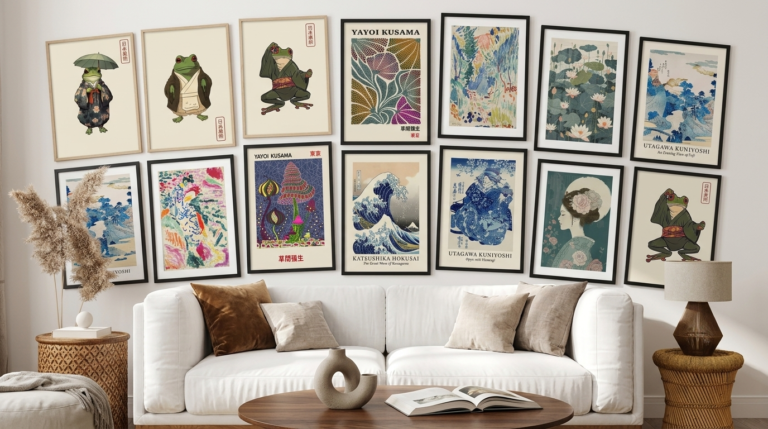
How Do You Choose Colors for a Gallery Wall?
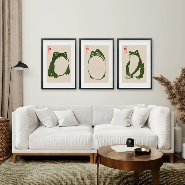
Pick one shared color or tone that runs through every piece, so the mismatched frames and art still feel like a set.
- Choose a common color thread (e.g., every piece has some blue)
- Keep frame colors consistent (all black, all wood, or all white)
- Limit the total palette across all pieces to 3-4 colors
Wanted Wall Art Sets for Every Room visit –
What Common Mistakes Should You Avoid When Choosing Wall Art Colors?
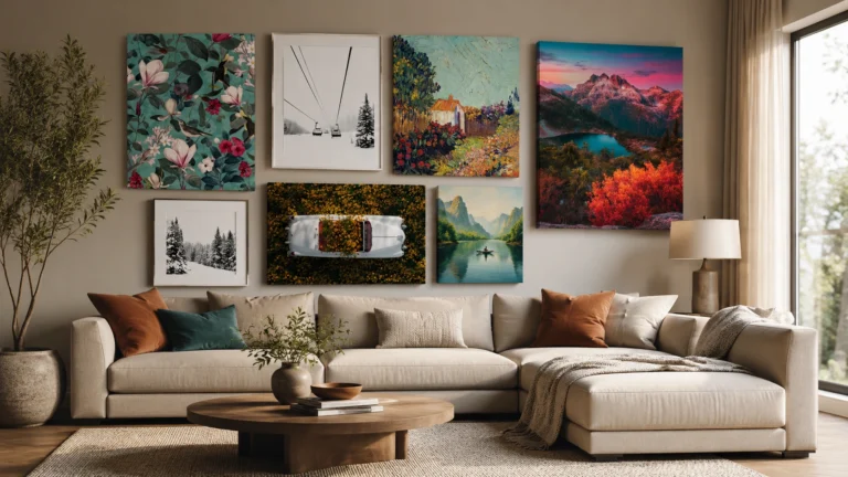
The most common mistake is choosing art with zero color connection to the room, which makes it look randomly placed.
- ❌ Art colors that clash instead of complement
- ❌ Too many competing bold colors in one space
- ❌ Ignoring the room’s lighting when picking tones
- ❌ Mismatched frame colors in a gallery wall
- ❌ Choosing art purely on trend, ignoring the room’s palette
Final Thoughts
Choosing the right wall art colors for living room spaces comes down to one idea: create a connection, whether through matching or intentional contrast. Follow these 9 rules, and your art will always feel like it belongs.




8 Comments