What Wall Art Goes With a Beige Sofa? 7 Color Combinations + Product Picks
Disclosure: Some links below are affiliate links. If you buy through them, this site may earn a commission at no extra cost to you.
A beige sofa looks like the easy part of a living room. Then you stand in front of the empty wall, and nothing feels right. The art looks disconnected, or the whole room turns into one beige block. Sometimes black art looks too harsh, or a color that looked great online clashes with the sofa. A pale print can wash out entirely.
These problems usually come down to three things: the sofa’s undertone, the contrast between art and wall, and the scale of the art. This guide covers all three, then walks through seven color directions with real wall-art examples.
Quick Answer: What Color Wall Art Goes With a Beige Couch?
Strong directions for a beige, cream, tan, or taupe sofa are earthy tones, greens, blues, black and white, terracotta or rust, soft neutrals, and controlled multi-color art. No single one is best. The right choice depends on your sofa’s undertone, wall color, flooring, lighting, existing decor, the mood you want, artwork size, and personal taste.
| Wall-Art Color Direction | Visual Effect | Works Especially Well When |
|---|---|---|
| Earthy tones | Warm, grounded | Your room has wood, linen or natural textures |
| Green | Natural, fresh | You want contrast that isn’t stark |
| Blue | Cooler contrast | Your sofa leans warm, and you want balance |
| Black & white | Graphic, modern | The room feels flat and needs definition |
| Terracotta/rust | Warm, energetic | You want warmth without repainting |
| Soft neutrals | Calm, minimalist | The art has texture or tonal variation |
| Cream/beige | Tonal, understated | Walls are darker than the art |
First, Identify Your Beige Sofa’s Undertone
“Beige goes with everything” is the advice that leads to bad art choices. Beige is a family of colors, and its undertone changes how nearby colors look.
Warm beige leans yellow, cream, sand, caramel, or warm taupe. Cool beige leans gray, greige, or muted taupe. Tan sits on the warmer, deeper end. Cream is lighter and usually warm. Darker beige has lower value (lightness), which changes how much contrast you need.
Try these checks:
- Hold a sheet of pure white paper next to the fabric. Warm beige looks yellow or peachy beside it. Cool beige looks grayer.
- Look in daylight. Artificial light shifts color a lot.
- Compare with a gray object. Cool beiges sit comfortably beside gray. Warm ones look more golden.
- Ask which word fits: yellow/cream/sandy or gray/taupe.
- Check it under warm evening lamps. Many beiges turn more yellow after dark.
Photos can distort color, including the photos in this article and on any store page. Trust your own room.
Why it matters: a warm beige sofa often pairs well with cooler accents such as muted blue, or with related warm tones like terracotta. A cool beige can look muddy next to strongly yellow-orange art but works well with greens, blue-grays, and black. These are tendencies, not rules. Always check the actual art in your actual light.
For hue, saturation, and value, you only need three ideas:
- Hue is the color family.
- Saturation is how vivid it is. Muted colors blend into neutral rooms more easily than saturated ones.
- Value is lightness. Art much darker or lighter than the sofa adds contrast. Art close in value can look flat.
The 7 Color Combinations
1. Beige + Black or Charcoal
This is the strongest contrast. Black and charcoal add graphic definition and suit modern or minimalist rooms. Black-and-white photography, ink-style abstracts, and pieces with dark accents all work.
The risk is harshness, especially with a light cream sofa and white walls. Wood tones, warm lighting, and a mat or wood frame soften the edge. Charcoal is gentler than pure black. Art that is mostly gray tones with small black accents gives definition without a stark look.
Best for: warm or cool beige in modern rooms. Walls: white, cream, light greige. Avoid: heavy black frames on a very small piece.
Example: Set of 3 Black and White Mountain Forest Prints. Its listing describes a monochrome mountain landscape with snow-capped peaks, evergreen forest, and misty valley. Pale mist tones stop it from reading as pure black-on-white.
Explore wall art with black and neutral accents →
2. Beige + Earthy and Natural Tones
Sand, brown, clay, muted tan, and ochre extend the sofa’s own warmth. The danger here is one flat beige block. To avoid it, choose art with variation in value, meaning some darker browns or deep shadows and some lighter areas, or pick a piece with a small cool accent.
Natural landscapes work well here because they combine several earth tones in one composition.
Best for: warm beige and tan sofas; rooms with wood floors. Avoid: art that is almost the exact color of the sofa.
Example: 3 Piece Coastal Landscape (Waves, Surfers, Beach Pathway). Its photo names describe sand, dunes, and blue ocean, so it pairs sandy tones with a blue counterpoint.
See earthy coastal wall art →
3. Beige + Green
Olive, sage, forest, and botanical greens sit naturally beside beige. Green gives contrast without the starkness of black. Botanical and abstract pieces both work.
Very bright, saturated green can feel disconnected from a neutral room. Muted or gray-leaning greens are easier to blend in. On a cool-beige sofa, sage and blue-greens tend to look calm. On a warm sofa, olive feels more related.
Example: Green Watercolor Botanical Herbal Wall Art Set of 3 Prints. A watercolor botanical set in green, which suits a softer, plant-inspired look.
See green-toned wall art options →
4. Beige + Blue
Navy, dusty blue, blue-gray, and coastal blues bring cooler contrast. Warm beige and cool blue are near opposites, which makes the pairing lively but balanced.
Highly saturated blue can dominate a calm room. Muted blue is usually easier to integrate. If your sofa is a cool greige, blue-gray art creates a subtle analogous relationship instead of strong contrast.
Example: Light Blue Hydrangea Flower Wall Art Poster Set. A botanical triptych with light blue flowers, on the soft side of blue.
Explore blue wall art that can contrast with beige furniture →
5. Beige + Terracotta or Rust
Terracotta, rust, clay, and burnt orange are warm, energetic accents that relate to warm beige. You don’t need art that is mostly orange. One or two terracotta areas, paired with green or neutrals, are enough.
If your sofa is cool beige or greige, test carefully. Strong orange next to gray-beige can look mismatched.
For more on this palette, see this GlitchArt roundup of terracotta, rust and olive wall art.
Example: 3 Piece Terracotta Boho Wall Art, Green Tropical Leaves. Green leaves on terracotta backgrounds. Its product photo shows it above bedding in beige and white.
See terracotta wall art →
6. Beige + Soft Neutrals, Cream and White
Tonal rooms feel calm, minimalist, or Scandinavian. The risk is that beige, cream and white can flatten into one plane.
Fix it with composition, not color. Look for art with tonal range, meaning lighter and darker passages. Also look for texture (brushwork, watercolor) and negative space. A mat or a wood frame adds an edge. Cream art on a cream wall may disappear, so pick a frame or mat that separates the two.
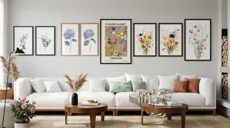
Example: Meadow Flower Watercolor Wall Art Poster Set. Described as watercolor flowers in soft neutral tones.
See soft neutral wall-art options →
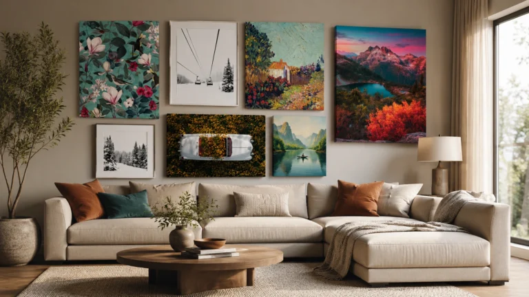
7. Beige + Colorful or Multi-Color Art
A neutral sofa is a good base for a statement piece. To keep it from looking chaotic:
- Choose one dominant color and one or two accents in the art.
- Echo one of those colors elsewhere in the room, such as a cushion or a curtain you already own.
- Keep everything else quiet. Let the art be the single focal point.
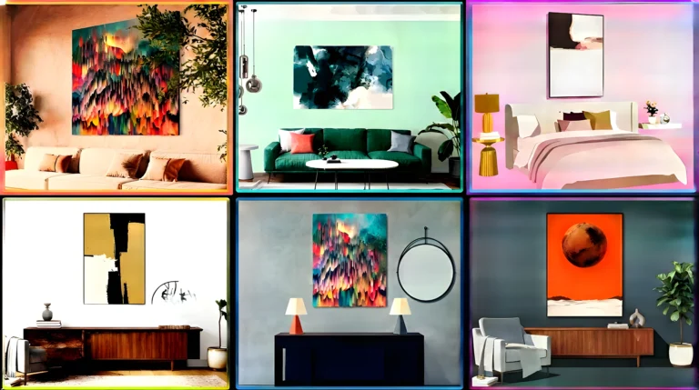
Example: Henri Matisse Abstract Painting Wall Art Prints. The collection tile describes three colorful abstract paintings. Check the actual palette on the product page and choose the size that fits your wall.
See colorful statement wall art →
Which Wall-Art Style Works With a Beige Sofa?
- Abstract: Look for one or two accent hues over neutrals. Good for adding contrast in a plain room.
- Botanical: Greens and earthy tones echo natural fabrics and wood.
- Landscape: Extends a neutral palette. Sand, stone, forest, and sea can all work.
- Black-and-white: Adds definition and works with almost any undertone.
- Minimalist: Relies on negative space and tonal shifts. Watch for flatness.
- Modern/contemporary: Geometry and contrast keep a beige room from looking flat.
How Wall Color Changes the Answer
The same art looks different on different walls. A soft cream print on a cream wall can vanish. Dark art on a white wall gives strong definition. A colorful piece on a greige wall becomes the focal point. On a darker accent wall, lighter art stands out.
Think in terms of contrast between the art and the wall behind it, not just the sofa. Rigid rules break down here, so hold samples or a printed photo against the wall.
Repeat a Color, Don’t Match Everything
Look at what’s already in the room: flooring, wood tones, curtains, an existing rug, an accent chair, lighting. Then pick art that picks up one or two of those tones. You don’t need to copy the whole room. This is the difference between a room that feels considered and one that feels staged.
Should Wall Art Match the Sofa?
No. It doesn’t need to match exactly. There are four different relationships:
- Matching: nearly the same color. Risks flatness.
- Coordinating: colors that belong to the same family.
- Contrasting: deliberately different, such as beige with black or blue.
- Echoing: repeating one color from elsewhere in the room.
Exact matching can look overly coordinated. Coordinating and echoing usually feel more natural.
If Your Room Is Already Very Neutral
If the room has a beige sofa, a beige rug, cream curtains, and white walls, add interest with:
- Contrast: darker or more saturated art than the room.
- Art color: one clear accent hue (green, blue, terracotta).
- Texture and composition: watercolor, landscape depth, negative space.
- Scale: a bigger piece makes a stronger statement.
- Darker accents: a black or wood frame or mat.
Any of the examples above can do this. The black-and-white landscape and the terracotta and green set are the most direct fixes for a flat room.
How Big Should Wall Art Be Above a Beige Sofa?
A widely used guideline is art that spans roughly two-thirds to three-quarters of the sofa’s width. Measure the sofa, then include the frame when you check the art’s footprint. Leave breathing room around the piece and keep the bottom edge close enough to the sofa that they read as one group.
For step-by-step help, see our guide to choosing wall art above a sofa, how to hang wall art above a sofa, and what size wall art suits a large wall.
Quick math for sets: three 16×20 in prints side by side cover about 48 in of art width before gaps. Three 24×36 in prints cover about 72 in. The store’s listed sizes are per print, so multiply for the full set.
One Large Piece vs Multiple Pieces
- One large piece: Minimalist rooms, a strong focal point, simple compositions.
- Two pieces: Wider walls with a balanced, paired look.
- Triptych / multi-panel: Wide spaces and contemporary rooms. It creates horizontal movement.
With multiple pieces, color coordination matters even more, because every panel adds another color decision. Sets designed as a single image help.
How to Choose Artwork from an Online Store
- Check actual dimensions. For sets, the size may be per print.
- Check orientation (portrait, landscape, square).
- Identify dominant colors.
- Identify secondary colors.
- Check the frame or border. On wallartset.com, framed sizes are the visible area inside the frame, including any mat.
- Look at lifestyle photos in different lighting.
- Check whether it’s one piece or a multi-panel set.
- Ask if the colors suit your undertone.
- Confirm the size works for your wall.
Thumbnails can mislead. Screens shift color, and small images hide detail.
Decision Guide
- Modern, high-contrast look? Consider black or charcoal art.
- Natural, relaxed look? Consider green or earthy art.
- Cooler contrast? Consider blue art.
- Warmth and energy? Consider terracotta or rust.
- Calm, minimalist room? Consider soft neutral or cream art with texture.
- Art as focal point? Consider controlled multi-color art.
- Room already colorful? Choose art that repeats one or two existing colors.
Common Mistakes with Beige Sofas
- Art almost the same beige as the sofa. Add value contrast or a different hue.
- Ignoring undertone. Compare against white and gray first.
- Too many accent colors. Limit to one dominant and one or two accents.
- Over-saturated art. Pick muted versions or make sure the room can support it.
- Matching everything exactly. Echo one or two colors instead.
- Ignoring wall color. Test contrast against the wall.
- Wrong size. Measure the sofa and the art, including the frame.
- Buying from photos only. Check descriptions, sizes, and multiple images.
- Forgetting the frame. Black, white, and wood frames each shift the look.
- Competing focal points. Let one piece lead.
Wall Art Product Picks by Use Case
These are examples, not rankings. Availability and sizes change, so confirm on each page.
If You Want Black + Beige Contrast
Set of 3 Black White Mountain Forest Prints →
- Verified dimensions: Not individually verified. Confirm per-print size on the product page.
- Dominant colors: Black, white, gray (per listing description).
- Secondary colors: Misty pale grays.
- Orientation: Confirm on page.
- Style: Monochrome landscape triptych.
- Best suited for: Modern or minimalist rooms.
- Why it works: Chosen because the monochrome palette adds definition against beige without introducing a competing hue.
- Consideration: Very high contrast on a pale sofa and walls. Consider a wood or mat frame to soften it.
If You Want Earthy Warmth
3 Piece Coastal Landscape: Waves, Surfers, Beach Pathway →
- Verified dimensions: Not individually verified.
- Dominant colors: Sand and beige tones with blue (per photo descriptions).
- Orientation: Confirm on page.
- Style: Coastal landscape.
- Why it works: Chosen because its sandy palette relates to a warm sofa and the blue adds a counterpoint, which helps avoid a flat beige-on-beige look.
- Consideration: Surfing imagery may not suit every decor style.
If You Want Green / Botanical Contrast
Green Watercolor Botanical Herbal Wall Art Set of 3 Prints →
- Verified dimensions: Not individually verified.
- Dominant colors: Green.
- Orientation: Confirm on page.
- Style: Watercolor botanical.
- Why it works: Chosen because a soft watercolor green adds natural contrast without a highly saturated accent.
- Consideration: Check the green’s warmth against your undertone.
If You Want Blue Contrast
Light Blue Hydrangea Flower Wall Art Poster Set →
- Verified dimensions: Not individually verified.
- Dominant colors: Light blue.
- Orientation: Confirm on page.
- Style: Botanical triptych.
- Why it works: Chosen because light, muted blue gives a cooler contrast that is easier to integrate than strong navy.
- Consideration: Light art can fade against white walls.
If You Want Terracotta / Rust
3 Piece Terracotta Boho Wall Art: Green Tropical Leaves →
- Verified dimensions: Page lists per-print sizes: 8×10, 11×14, 12×16, 12×18, 16×20, 18×24, 20×24, 20×28, 20×30, 24×36 in. Framed sizes are the visible area inside the frame.
- Dominant colors: Terracotta with green leaves.
- Orientation: Confirm on page.
- Style: Abstract botanical, boho.
- Why it works: Chosen because terracotta relates to warm beige and the green keeps it from being all orange.
- Consideration: Showed “Sold out” when checked. Remove if still unavailable.
If You Want Soft Neutral Minimalism
Meadow Flower Watercolor Wall Art Poster Set →
- Verified dimensions: Not individually verified.
- Dominant colors: Soft neutral tones (per listing).
- Orientation: Confirm on page.
- Style: Watercolor botanical.
- Why it works: Chosen because the soft palette keeps a calm tonal room while brushwork adds texture.
- Consideration: Can look flat on cream walls. Use a contrasting frame or mat.
If You Want a Colorful Statement Piece
Henri Matisse Abstract Painting Wall Art Prints →
- Verified dimensions: Not individually verified.
- Dominant colors: Multi-color abstract. Confirm the exact palette on the page.
- Orientation: Confirm on page.
- Style: Abstract.
- Why it works: Chosen because bold abstract color on a neutral sofa creates a clear focal point.
- Consideration: Echo one of its colors elsewhere so it doesn’t feel isolated.
FAQs
What wall art goes with a beige sofa?
Earthy tones, greens, blues, black and white, terracotta, and soft neutrals can all work. Start by checking whether the sofa is warm or cool.
What color wall art goes with a cream sofa?
Cream is a light, usually warm neutral. It pairs with black for definition, muted blue or green for contrast, or terracotta for warmth. Avoid near-identical cream art on cream walls.
What color art goes with a tan sofa?
Tan is deeper and warmer. Blues, greens, and black-and-white give contrast. Earthy art needs value variation to avoid blending in.
What wall art suits a taupe or greige sofa?
These lean cooler. Blue-gray, sage green, charcoal, and black-and-white tend to feel harmonious. Test warm oranges first.
Does wall art have to match the sofa
No. Coordinate or echo instead.
What wall art goes above a beige sofa?
A piece or set about two-thirds to three-quarters of the sofa’s width, chosen for color direction and undertone.
Final Checklist
□ Identify whether your beige sofa is warm or cool
□ Check the wall color
□ Choose the visual mood you want
□ Select a compatible color direction
□ Check artwork size
□ Consider sofa-to-art proportions
□ Check artwork orientation
□ Look at dominant and secondary colors
□ Test how the artwork works with existing room colors
□ Compare suitable wall-art options
Once you know your undertone and your mood, browse the wall art collection and filter for the color direction you chose.