12 Dreamy Cottagecore Bedroom Posters to Turn Your Room Into a Woodland Escape
You know the bedroom you’re picturing. Linen bedding in a soft, worn-in cream. A dried-flower bundle on the windowsill. Maybe a little wooden stool holding a stack of books and a candle that’s never quite lit. The only thing missing is the wall above the bed — and a blank wall in a cottagecore room feels like a sentence that trails off.
Cottagecore bedroom posters are the fastest way to finish that sentence. Unlike furniture or paint, a single piece of wall art can introduce an entire mood — a mushroom-dotted forest floor, a moth circling a lantern, a hedge thick with eucalyptus — without you having to repaint or reupholster anything. And because cottagecore leans so heavily on nature, folklore, and softness, the right poster does more decorating work per square foot than almost anything else in the room.
This guide walks through twelve cottagecore bedroom posters that sit squarely in the woodland, botanical, and storybook end of the aesthetic — the mushrooms-and-moss end, not the generic “boho florals” end — and breaks down which ones suit which kind of bedroom, where to hang them, and what palettes they pull from. If you’ve been scrolling for cottagecore bedroom posters and getting either mass-market florals or nothing at all, this is built for you.
Quick Picks
If you want the short version before the full breakdown, start here. Every pick links straight to the poster on Redbubble.
Best Overall — Minimalist Botanical Mushroom Cottagecore Woodland Soft, watercolor-style mushrooms and foliage that read as cottagecore without saying a single loud thing.
View This Poster →
Best for a Calm Bedroom — Botanical Prints: Eucalyptus Illustration Muted greens and simple linework for a bedroom that needs to feel restful, not busy.
View This Poster →
Best for a Magical Look — Magical Enchanted Forest Mushrooms, moss, and a soft glow that leans fairycore and cottagecore at once.
View This Poster →
Best Vintage Option — Vintage Birds & Leaves Pattern An engraved, old-botanical-plate look that grounds a room in something timeless.
View This Poster →
Best for a Dark Cottagecore Bedroom — Mysterious Garden at Night Moonlit plants on a deep, dreamy background for anyone drawn to the moodier side of cottagecore.
View This Poster →
Best Dreamy Landscape — Blossoming Spring Orchard Path A soft pink blossom path that works like a window onto a storybook spring.
View This Poster →
Not sure which of these actually fits your wall? Keep reading — the sections below break each one down by mood, palette, and placement, and there’s a poster size guide further down if scale is what’s holding you back.
The Full Collection: 12 Cottagecore Bedroom Posters
1. Minimalist Botanical Mushroom Cottagecore Woodland
This one leads the list because it does the most with the least. The design is a loose, watercolor-style arrangement of mushrooms and small botanical details — nothing overworked, nothing crowded. It reads as cottagecore instantly, but it’s quiet enough to live in a small bedroom without dominating it.
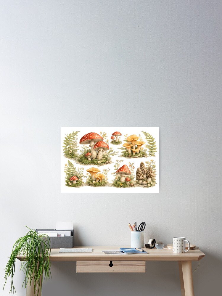
Best for: Small bedrooms, minimalist cottagecore rooms, anyone who wants “cottagecore” without clutter.
Styling advice: This is a strong single piece above a nightstand or reading chair, where its scale won’t compete with anything. It also works well centered above a dresser if you want a focal point without a gallery wall.
Color guidance: Soft greens, warm cream, and muted earth tones — pair naturally with beige linens or a sage accent wall.
Why it works: Cottagecore rooms often struggle to feel “collected” rather than “cluttered.” A single, well-chosen botanical piece like this one gives you the aesthetic signal without the visual noise, which is exactly what a small or minimalist space needs.
2. Magical Enchanted Forest
Mushrooms, moss, ferns, and a soft glowing light run through this piece, giving it a fairycore-adjacent feel that still sits comfortably in cottagecore territory. It’s more atmospheric than the minimalist mushroom design above — closer to a scene than a still-life.
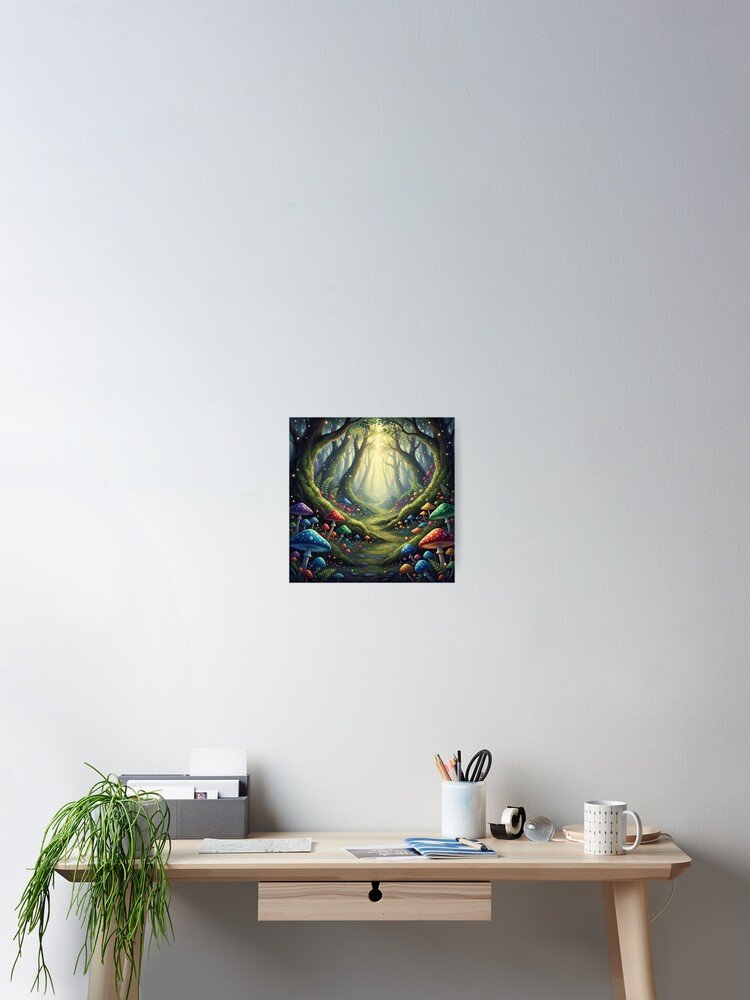
Best for: Bedrooms leaning into fairycore or “magical woodland,” reading corners, anyone who wants their room to feel like it belongs in a forest at dusk.
Styling advice: Because the piece carries its own sense of depth and light, it makes a good accent-wall anchor rather than a small nightstand piece — give it room to be the visual story of that wall.
Color guidance: Deep greens with warm, glowing undertones. Pairs well with forest green bedding or warm wood furniture.
Why it works: A glowing, atmospheric forest scene does the job that string lights or a Himalayan salt lamp are often asked to do — it adds warmth and a sense of enchantment — but it’s permanent, doesn’t need an outlet, and reads as intentional design rather than a dorm-room fix.
3. Botanical Prints: Eucalyptus Illustration
A calmer, more restrained piece: eucalyptus branches and native wildflowers rendered in natural greens. Where the mushroom and forest pieces lean whimsical, this one leans serene — it’s closer to a spa or reading-nook aesthetic than a fairy tale.
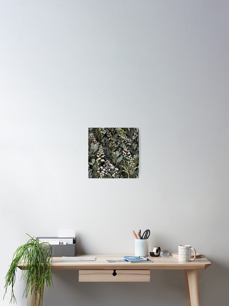
Best for: Calm or neutral bedrooms, anyone blending cottagecore with a more Scandinavian or Japandi base, bedrooms that need one restful anchor rather than a statement piece.
Styling advice: Works beautifully above a bed when paired with simple, unfussy bedding — it doesn’t need a gallery wall around it to feel finished. It’s also a good choice for a small guest room where you want “botanical” without “busy.”
Color guidance: Sage and eucalyptus green against cream or white. This is the piece to reach for if your existing decor already leans neutral and you don’t want to introduce a lot of new color.
Why it works: Botanical illustration in a limited green palette gives a room a sense of freshness without forcing a full cottagecore overhaul — useful if you’re testing the aesthetic before committing further.
4. Mysterious Garden at Night: Surreal Botanical Fantasy
Moonlit plants against a dark, dreamy palette. This is the piece for anyone drawn to “dark cottagecore” — the side of the aesthetic that trades pastel softness for something a little more gothic and nocturnal, without tipping into full horror-decor territory.
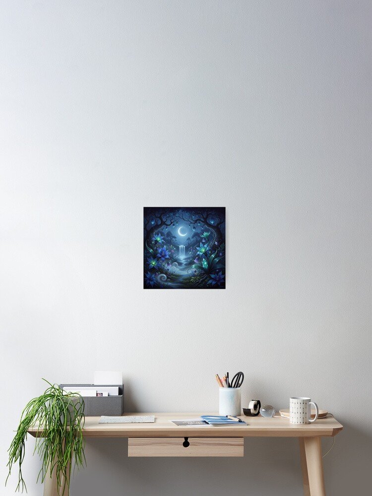
Best for: Dark cottagecore bedrooms, moody accent walls, bedrooms with deep-toned bedding (forest green, plum, charcoal) that a pastel poster would clash with.
Styling advice: Because the background is dark, this piece needs a wall with enough contrast to let it read clearly — a lighter wall color will make it pop far more than a similarly dark wall will. It’s a strong single statement piece above a bed rather than a gallery-wall component.
Color guidance: Deep, dark tones with glowing highlights. Pair with black-framed furniture, dark wood, or deep green textiles.
Why it works: Not every cottagecore bedroom is bright and airy — plenty of people want the nature-and-nostalgia feeling without the sunny palette. This poster gives that reader an option that still fits the woodland-botanical theme.
5. Vintage Birds & Leaves Pattern: Classic Engraved Nature
An elegant, engraved-style pattern of small birds, branches, and delicate leaves — the kind of illustration you’d expect to find in an old botanical field guide. It’s the most “traditional cottagecore” piece in the collection: think grandmother’s cottage rather than modern fairycore.
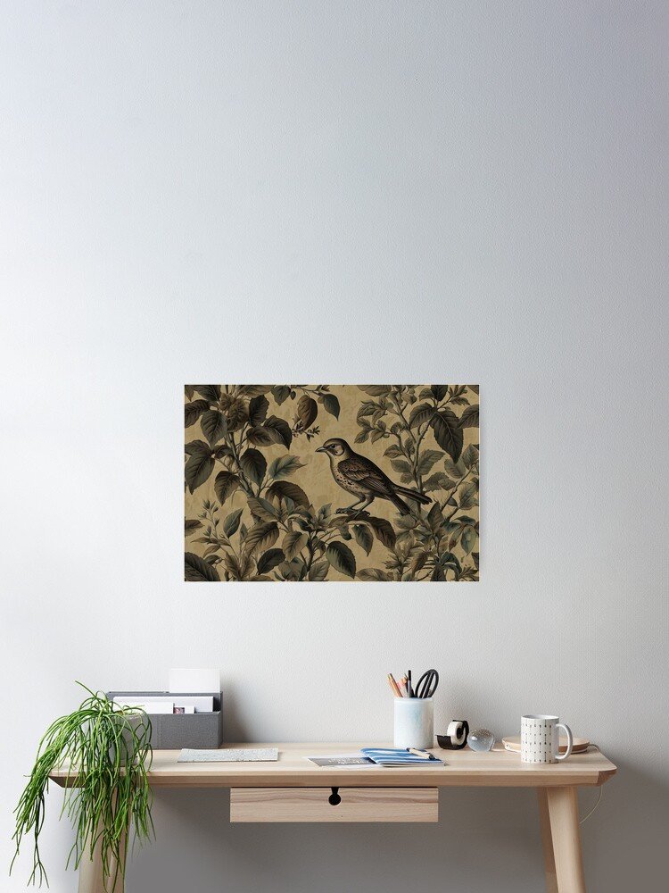
Best for: Classic or vintage cottagecore rooms, reading corners, anyone mixing in antique or secondhand furniture.
Styling advice: This pattern’s fine detail rewards a closer viewing distance, which makes it well suited to a reading chair wall or a smaller gallery-wall grouping rather than a large expanse above the bed where the detail would be lost from across the room.
Color guidance: Warm sepia and cream tones. Pairs naturally with wood furniture, brass hardware, and warm neutral bedding.
Why it works: Vintage engraved botanical art has been a design staple for centuries for a reason — it adds a sense of history and permanence to a room, which is exactly the feeling classic cottagecore is trying to recreate.
6. Blossoming Spring Orchard Path
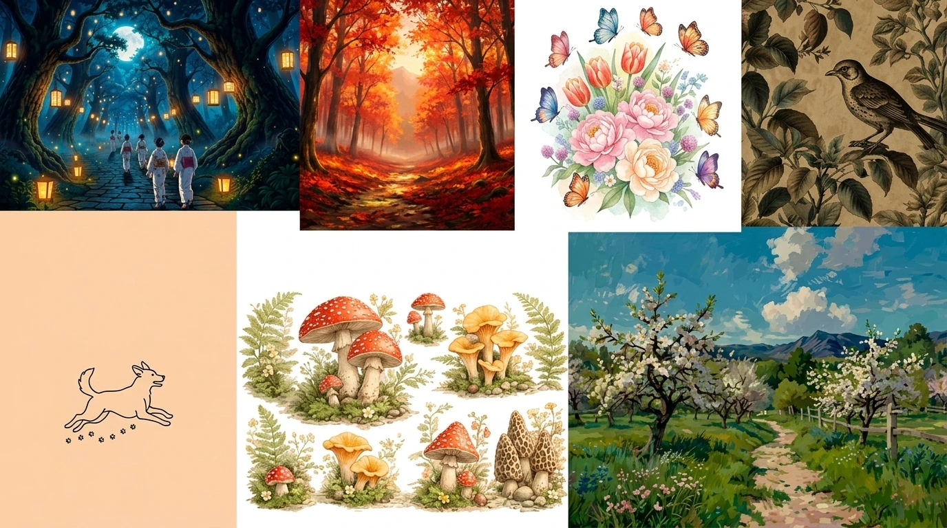
A soft, dreamy path lined with pink blossom trees. Of everything on this list, this piece leans most toward “storybook” — it reads like an illustration from a picture book about a spring afternoon, and it’s the softest, most pastel option in the collection.
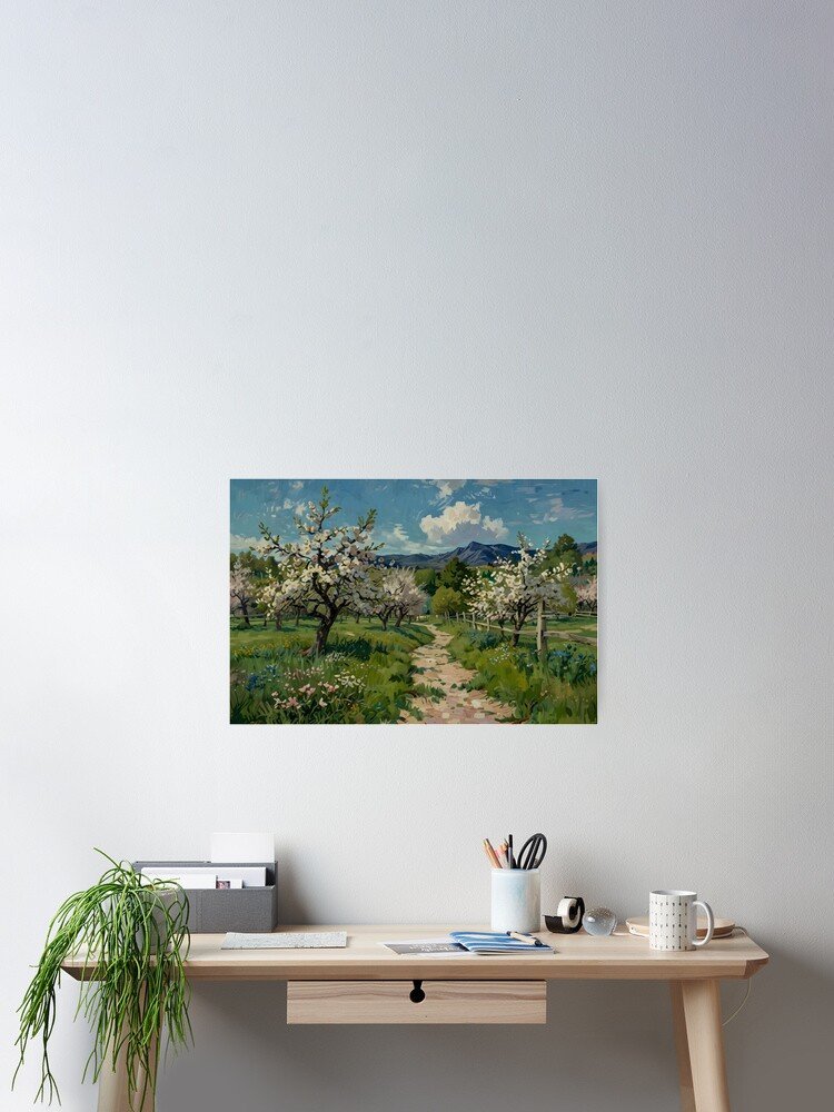
Best for: Storybook or dreamy-nature bedrooms, spring-toned rooms, anyone who wants florals without going fully floral-print.
Styling advice: Because it reads as a landscape rather than a still-life, it works well as a single large piece above the bed, giving the eye somewhere to “walk into” rather than sitting flat on the wall.
Color guidance: Soft pink blossoms against pale greens and warm neutrals. Pairs with blush or cream bedding and warm wood tones.
Why it works: A landscape-style poster adds a sense of depth to a wall that a pattern or still-life can’t — useful in a smaller room where you want the illusion of more visual space.
7. Tranquil Forest Retreat
A dense, vibrant green forest scene — closer to lush jungle greenery than a delicate woodland sketch. It’s the most saturated, immersive piece in the collection, and it works well for readers who want a fuller, more jungle-adjacent take on “forest bedroom.”

Best for: Nature-inspired rooms that want more color saturation than the softer botanical pieces offer, plant-filled bedrooms that already lean green.
Styling advice: This piece can stand on its own above a bed in a room that already has a fair amount of greenery (real or artificial), tying the plants and the wall art into one cohesive green moment.
Color guidance: Rich, saturated greens. Works with a room that already leans jungalow or has a lot of houseplants.
Why it works: Cottagecore and jungalow overlap more than people expect — both are built around bringing the outdoors in — and a denser forest scene like this one bridges the two nicely for a bedroom that wants a bit more visual richness than pastel cottagecore usually offers.
8. Delicate Butterfly & Floral: Botanical Spring Nature
Vibrant butterflies moving through colorful flowers, rendered in a delicate watercolor style. Where the eucalyptus piece is calm and monochrome-green, this one is the most colorful botanical option on the list.
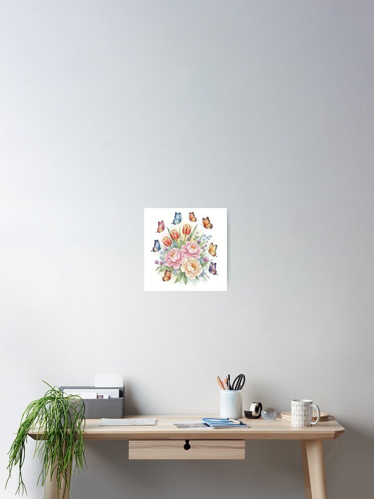
Best for: Bedrooms that want cottagecore with more color variety, spring-and-summer-toned rooms, gallery walls that need a brighter accent.
Styling advice: This piece works particularly well as one part of a gallery wall grouping, where its color can play against quieter, more muted neighbors like the eucalyptus or vintage bird prints.
Color guidance: Multi-tone florals — pinks, yellows, and greens together. Best in a room that already has some color rather than a strictly neutral palette.
Why it works: A gallery wall built entirely from muted, similar-toned pieces can start to feel flat. One brighter, more colorful piece like this gives the eye a place to land.
9. Autumn Trails: Yunnuo Landscape Fall Forest Art
A warm, glowing forest trail scene built around autumn’s orange and amber tones. It’s the seasonal outlier in this collection, but it earns its place for anyone building a cottagecore bedroom around a warm, fall-leaning palette year-round.
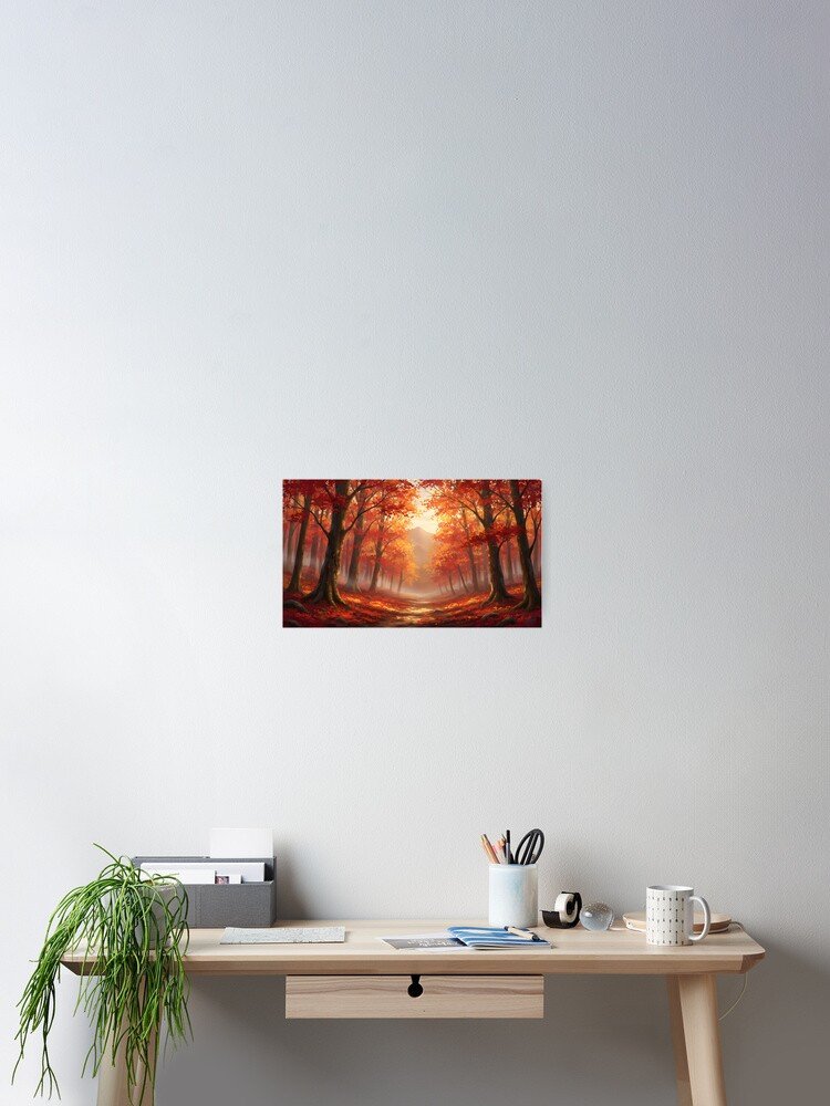
Best for: Warm-toned bedrooms, autumn-inspired cottagecore rooms, anyone who wants “cozy” to mean amber and rust rather than sage and cream.
Styling advice: Pairs naturally with the vintage bird print for a warm-toned gallery-wall grouping, or stands alone above a dresser in a room built around a rust-and-cream palette.
Color guidance: Warm orange, amber, and brown tones. Pairs with terracotta, rust, or warm wood accents rather than the cooler sage-green cottagecore palette.
Why it works: Not every cottagecore bedroom is built on sage and cream — a warm, amber-toned room is just as valid an interpretation of “cozy woodland,” and this piece is the anchor for that version of the aesthetic.
10. Cute Hedgehog Pattern: Kawaii Forest Critter
A pattern of tiny, curled-up hedgehogs holding mushrooms — playful, small-scale, and unmistakably whimsical. This is the piece to reach for if your cottagecore bedroom wants a lighter, more youthful touch.
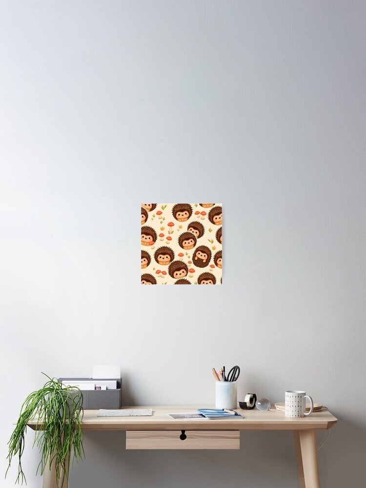
Best for: Playful or whimsical cottagecore rooms, smaller accent spaces, gallery walls that need a lighter, less serious note.
Styling advice: Because the pattern is made up of small repeated figures, it reads best up close — a nightstand wall or a smaller frame within a gallery grouping suits it better than a large solo placement above the bed.
Color guidance: Soft, muted tones with warm browns. Works well alongside the mushroom and vintage bird pieces without clashing.
Why it works: A whimsical, smaller-scale piece like this keeps a cottagecore room from feeling too serious or too “designed” — it’s the equivalent of a well-placed throw pillow that says the room doesn’t take itself too seriously.
11. Paws & Pawprints: Minimalist Dog Silhouette
A minimalist line-art dog silhouette with subtle pawprint accents. This piece isn’t woodland or botanical on its own, but it earns a spot for anyone who wants their gallery wall to nod to a pet as well as to the cottagecore aesthetic.
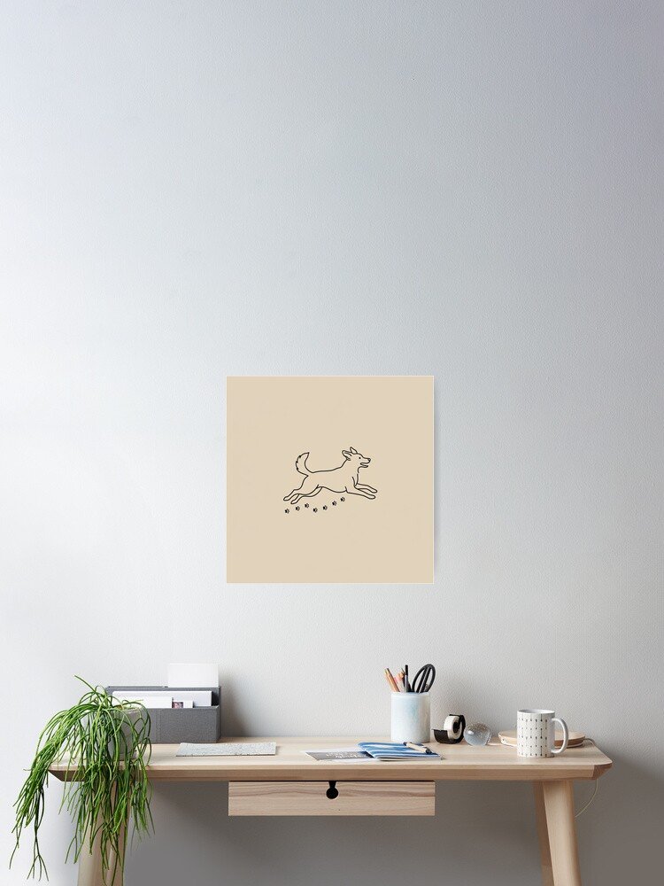
Best for: Dog owners building a gallery wall, bedrooms that want a modern, neutral counterpoint to softer botanical pieces.
Styling advice: Best used as one piece within a larger gallery-wall grouping rather than a solo statement — its clean, minimal lines give the eye a breathing space between busier botanical and pattern pieces.
Color guidance: Neutral line art on a plain background. Fits any existing palette without introducing new color.
Why it works: Gallery walls need visual rest stops as much as they need statement pieces. A simple, minimal silhouette breaks up a wall of pattern and illustration without fighting for attention.
12. Moonlight Forest Path: Mid-Autumn Lantern Walk
A whimsical forest path glowing with lanterns under a full autumn moon. This is the most storybook-nocturnal piece in the collection — somewhere between the dark, mysterious garden and the warm autumn trail, with its own glowing, lantern-lit atmosphere.
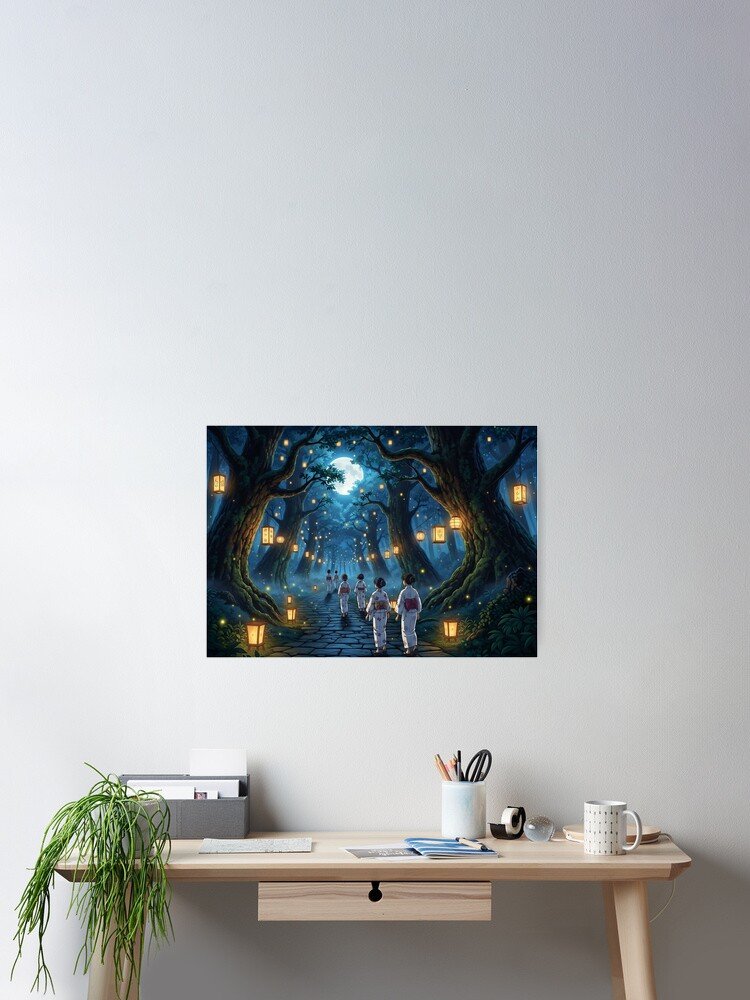
Best for: Dreamy nature or storybook-forest bedrooms, anyone who wants a nighttime scene without the darker, more surreal mood of the garden-at-night piece.
Styling advice: The glowing lanterns give this piece a natural focal point, which makes it well suited as a solo statement above the bed in a room with warm, low lighting to echo the poster’s own light source.
Color guidance: Deep blues and warm amber lantern glow. Pairs with warm wood tones and soft amber lighting rather than stark white.
Why it works: A lantern-lit forest path gives a room a sense of gentle storytelling — the kind of piece that makes a bedroom feel like the start of a bedtime story rather than a static backdrop.
How to Style Cottagecore Posters in a Bedroom
Above the bed. This is the most visually demanding spot in the room, so it rewards either one confident piece (the enchanted forest, the orchard path, or the moonlit lantern walk all work well here) or a tightly composed set of two to three matching-toned pieces. Avoid mixing more than two very different palettes directly above the headboard — it’s the first thing anyone sees when they walk in, and it reads best with a clear visual anchor.
Above a dresser. A slightly lower-stakes spot than above the bed, which makes it a good home for quieter pieces like the eucalyptus botanical or the minimalist mushroom design. This is also a natural spot for a single seasonal piece, like the autumn trail, if you like to rotate art with the seasons.
Beside a reading chair. Smaller, more detailed pieces earn their keep here, since you’ll actually be close enough to appreciate the fine linework — the vintage bird pattern and the hedgehog pattern both suit this spot better than they suit a large, distant wall.
Small bedroom walls. In a smaller room, resist the urge to fill every wall. One well-chosen piece — ideally something like the minimalist mushroom design or the eucalyptus print, both of which read as calm rather than busy — does more for a small space than a crowded gallery wall.
Gallery walls. This is where you can mix several pieces from this list without them fighting each other, as long as you keep a consistent thread running through the grouping — either a shared color palette (the warm-toned autumn trail and vintage bird print) or a shared mood (the whimsical hedgehog pattern and mushroom cottagecore design).
Empty accent walls. If you have one wall that’s begging for a focal point, an atmospheric piece like the enchanted forest or the mysterious garden at night can carry that wall on its own without needing supporting pieces around it.
Cottagecore Bedroom Poster Color Palettes
Choosing artwork gets much easier once you know which palette your bedroom is already working with.
| Palette | Pairs With | Posters to Consider |
|---|---|---|
| Sage green + cream | Neutral linens, light wood | Eucalyptus Illustration, Minimalist Mushroom |
| Warm beige + brown | Wood furniture, brass accents | Vintage Birds & Leaves, Autumn Trails |
| Forest green + muted gold | Deep green bedding, warm lighting | Magical Enchanted Forest, Tranquil Forest Retreat |
| Dusty floral tones + ivory | Blush or cream textiles | Delicate Butterfly & Floral, Blossoming Spring Orchard |
| Earthy neutrals + botanical green | Rattan, linen, natural texture | Minimalist Mushroom, Eucalyptus Illustration |
| Deep green + warm wood | Dark furniture, moody lighting | Mysterious Garden at Night, Moonlight Forest Path |
If you’re not sure which palette your room already leans toward, look at your bedding and your largest piece of furniture first — those two elements usually set the palette, and the artwork should support them rather than introduce a competing color story.
Which Cottagecore Poster Style Fits Your Bedroom?
Classic Cottagecore wants warmth, history, and a slightly old-fashioned feel. The Vintage Birds & Leaves pattern is the clearest fit here, with the Eucalyptus Illustration as a calmer supporting piece.
Woodland Cottagecore leans into forest textures — moss, mushrooms, bark. The Minimalist Botanical Mushroom design and the Tranquil Forest Retreat both anchor this style well.
Botanical Cottagecore is greener and more plant-forward than mushroom-forward. Reach for the Eucalyptus Illustration and the Delicate Butterfly & Floral piece.
Dark Cottagecore trades pastels for depth and mystery. The Mysterious Garden at Night is built for this style, and the Moonlight Forest Path supports it with a slightly warmer, lantern-lit variation.
Whimsical Cottagecore is playful rather than moody — think fairy tale, not gothic novel. The Cute Hedgehog Pattern and the Magical Enchanted Forest both lean into this.
Storybook / Dreamy Nature wants a bedroom that feels like stepping into an illustrated page. The Blossoming Spring Orchard Path and the Moonlight Forest Path both do this well.
Choose Your Poster Based on the Mood You Want
Calm and peaceful: Botanical Prints: Eucalyptus Illustration.
Cozy and warm: Autumn Trails and Vintage Birds & Leaves Pattern.
Magical and dreamy: Magical Enchanted Forest and Moonlight Forest Path.
Natural and botanical: Eucalyptus Illustration and Delicate Butterfly & Floral.
Dark and mysterious: Mysterious Garden at Night.
Playful and whimsical: Cute Hedgehog Pattern and Minimalist Botanical Mushroom.
What Poster Size Works Best in a Cottagecore Bedroom?
A small poster (roughly extra-small to small format) works best in tight spots — beside a reading chair, on a narrow strip of wall next to a window, or as one piece within a larger gallery wall. It’s the wrong choice as a solo statement above a queen or king bed, where it will look lost.
A medium poster is the workhorse size for most bedroom walls. It’s large enough to read as a statement above a dresser or nightstand without overwhelming the furniture beneath it.
A large statement poster earns its place above the bed or on a dedicated accent wall, where it needs to hold its own against a big expanse of empty space. This is where atmospheric pieces like the Enchanted Forest or Moonlight Forest Path do their best work.
A multiple-poster gallery wall is the most flexible option if you can’t settle on just one design — it lets you combine two or three pieces from this list (say, the mushroom design, the vintage bird pattern, and the hedgehog pattern) into a single cohesive display rather than picking a single “winner.”
Above a bed, err toward a larger single piece or a tightly grouped set rather than one small poster floating in a sea of wall — the goal is for the art to visually anchor the headboard, not compete with it.
Above a dresser, a medium piece usually fits best relative to typical dresser widths, giving you breathing room on either side without looking undersized.
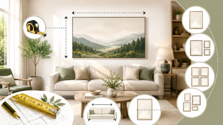
Not sure whether one large poster or a group of smaller prints will actually fill your wall the way you’re picturing? Measure the wall space above your bed or dresser and run it through GlitchArt66’s Wall Art Size Calculator before you commit — it takes the guesswork out of scale, which is the single most common mistake people make when buying bedroom wall art.
Not Sure Which Wall Art Style Fits Your Bedroom?
If you know you want to refresh your bedroom but you’re not sure whether you’re actually a “woodland cottagecore” person or a “dark cottagecore” person — or whether cottagecore is even the right direction for your space — that’s a completely normal place to be. Aesthetic labels are easier to spot in other people’s rooms than in your own.
Rather than guessing, GlitchArt66’s Wall Art Finder walks through a short set of questions about your room, your existing furniture, and the mood you’re after, then points you toward the styles and pieces most likely to fit. It’s a useful next step if this guide has narrowed things down but you still want a second opinion before you buy.
Comparison at a Glance
| Poster Style | Best For | Mood | Bedroom Placement |
|---|---|---|---|
| Woodland (Mushroom, Enchanted Forest) | Nature lovers | Cozy, magical | Above bed or dresser |
| Botanical (Eucalyptus, Butterfly & Floral) | Calm interiors | Fresh, serene | Above dresser or gallery wall |
| Vintage (Birds & Leaves) | Traditional cottagecore | Timeless | Reading corner or gallery wall |
| Dark Cottagecore (Garden at Night) | Moody, deep-toned rooms | Mysterious | Accent wall above bed |
| Storybook (Orchard Path, Moonlight Forest) | Dreamy, illustrative rooms | Whimsical | Above bed |
| Playful (Hedgehog, Dog Silhouette) | Lighthearted gallery walls | Cute, light | Gallery wall or nightstand |
Best For: Shopping Table
| Poster | Best For | Style |
|---|---|---|
| Minimalist Botanical Mushroom Cottagecore Woodland | Small or minimalist bedrooms | Woodland |
| Magical Enchanted Forest | Fairycore-leaning bedrooms | Whimsical woodland |
| Botanical Prints: Eucalyptus Illustration | Calm, neutral bedrooms | Botanical |
| Mysterious Garden at Night | Dark cottagecore bedrooms | Dark botanical fantasy |
| Vintage Birds & Leaves Pattern | Classic cottagecore bedrooms | Vintage engraved |
| Blossoming Spring Orchard Path | Dreamy, storybook bedrooms | Storybook landscape |
| Tranquil Forest Retreat | Jungalow-adjacent nature rooms | Lush forest |
| Delicate Butterfly & Floral | Colorful cottagecore bedrooms | Botanical spring |
| Autumn Trails: Yunnuo Landscape | Warm-toned bedrooms | Fall forest landscape |
| Cute Hedgehog Pattern | Playful, whimsical bedrooms | Kawaii woodland |
| Paws & Pawprints Dog Silhouette | Gallery walls, pet owners | Minimalist line art |
| Moonlight Forest Path: Mid-Autumn Lantern Walk | Nighttime, storybook bedrooms | Dreamy nocturnal |
Ready to Create a Cozy Cottagecore Bedroom?
Getting the wall right comes down to a short, repeatable sequence: pick the mood you want the room to have, match that mood to a style — woodland, botanical, vintage, dark, whimsical, or storybook — choose the cottagecore bedroom poster that fits it, confirm the size will actually suit your wall, and then shop the design.
If you’ve already found your favorite from the list above, most of that decision is made. If you’re still deciding between two or three cottagecore bedroom posters, go back to the palette your bedding and furniture already set, and let that be the tiebreaker.
Explore the Cottagecore Poster Collection → Start with the Minimalist Botanical Mushroom Cottagecore Woodland Poster, or scroll back up to the Quick Picks for the fastest path to your wall.
Frequently Asked Questions
What posters look good in a cottagecore bedroom?
Botanical illustrations, woodland scenes, mushroom motifs, vintage nature engravings, and soft storybook landscapes all work well. The common thread is a connection to nature rendered in a soft, illustrative style rather than a sharp, modern photograph.
How do I decorate my bedroom with cottagecore wall art?
Start with one anchor piece above the bed or on your main accent wall, then build outward with a gallery wall or a second smaller piece near a reading chair or dresser. Keep your palette consistent so the pieces feel chosen together rather than randomly collected.
What colors work best with cottagecore posters?
Sage green, cream, warm beige, muted gold, and earthy browns are the most common cottagecore palette. Dark cottagecore swaps these for deeper greens, near-black tones, and warm amber highlights.
What size poster should I put above my bed?
A large single poster or a tightly grouped set of two to three medium pieces generally works best above a queen or king bed. A single small poster tends to look undersized in that spot. Use a wall art size calculator to check your specific wall measurements before buying.
Are botanical posters good for bedrooms?
Yes — botanical art is one of the most versatile choices for a bedroom because it’s calming, pairs with almost any existing palette, and doesn’t compete with other decor the way bolder graphic prints can.
How do you create a cottagecore gallery wall?
Choose three to five pieces that share either a color palette or a consistent mood, mix in one or two smaller detail pieces (like a pattern or vintage print) alongside one larger anchor piece, and leave consistent spacing between frames rather than clustering them unevenly.
How many posters should you put in a bedroom?
There’s no fixed number — a single well-chosen statement piece is enough for many rooms, while a gallery wall might use anywhere from three to seven pieces. The right number depends on wall size and how much visual detail you want in the room.
What is the difference between cottagecore and dark cottagecore?
Classic cottagecore leans toward soft pastels, cream, and daylight-bright nature scenes. Dark cottagecore keeps the same nature-and-nostalgia themes but shifts the palette toward deep greens, near-black tones, and moonlit or nighttime settings.
What type of wall art works with a woodland bedroom?
Forest scenes, mushroom illustrations, moss and fern details, and woodland-critter patterns all support a woodland theme. Look for pieces with a sense of depth or atmosphere rather than flat, graphic patterns if you want the room to feel immersive.
Should bedroom posters be framed?
It depends on the look you want. An unframed poster with a simple wood or black frame reads as more casual and cottagecore-appropriate, while a heavier gallery frame can dress the same piece up for a more formal room. Either works — the poster’s paper and finish will look good with a simple frame either way.